URBN.com Redesign
Rethinking Urban Outfitters' Corporate Site
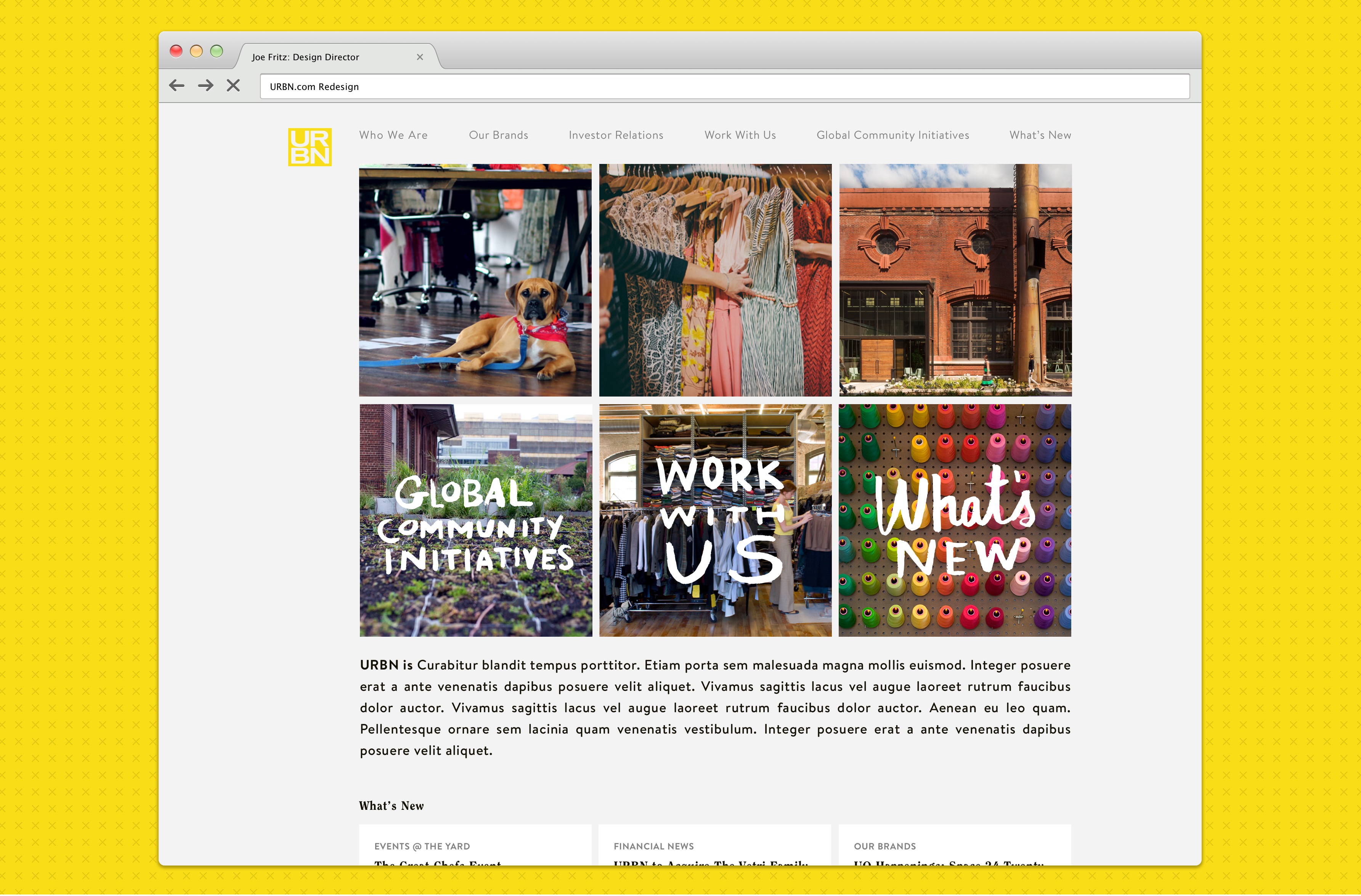
URBN.com acts as the corporate site and investor portal for brands such as Urban Outfitters, Free People, Anthropologie, and now Pizzeria Vetri. Our team worked with internal teams at URBN to redesign this site from the ground up.
Context
URBN.com users were never quite sure where they had to look to find the information that is important to them. Whether they were looking for jobs, investment information, contact information, or up-to-date news on the company, the site failed to deliver a clear path to information.
Proposed Solution
Working alongside a team of designers inside of URBN, we proposed a new site design; with a more rigorous information architecture, blogging capability, and an integrated search function.
Design Process
Working With an Outside Design Team
This project was a unique one in that our team of designers and developers worked closely with a team of internal URBN designers to develop a look and feel for this site. Our job was to take the ideas the URBN team had developed and flesh them out to work well on the web and mobile devices. This collaborative effort resulted in a nice site that works equally well on a mobile device as on a desktop.
Mockups
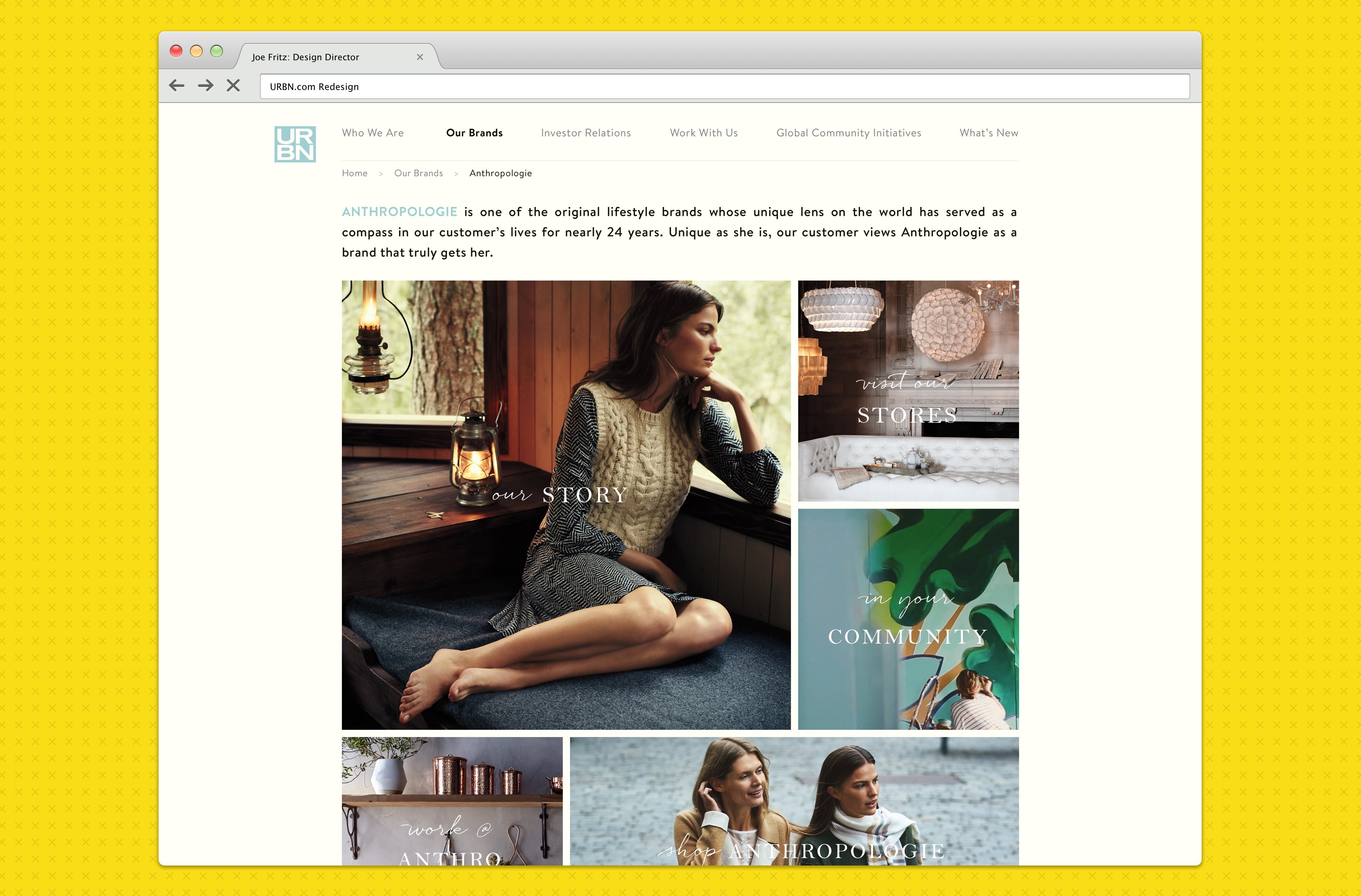
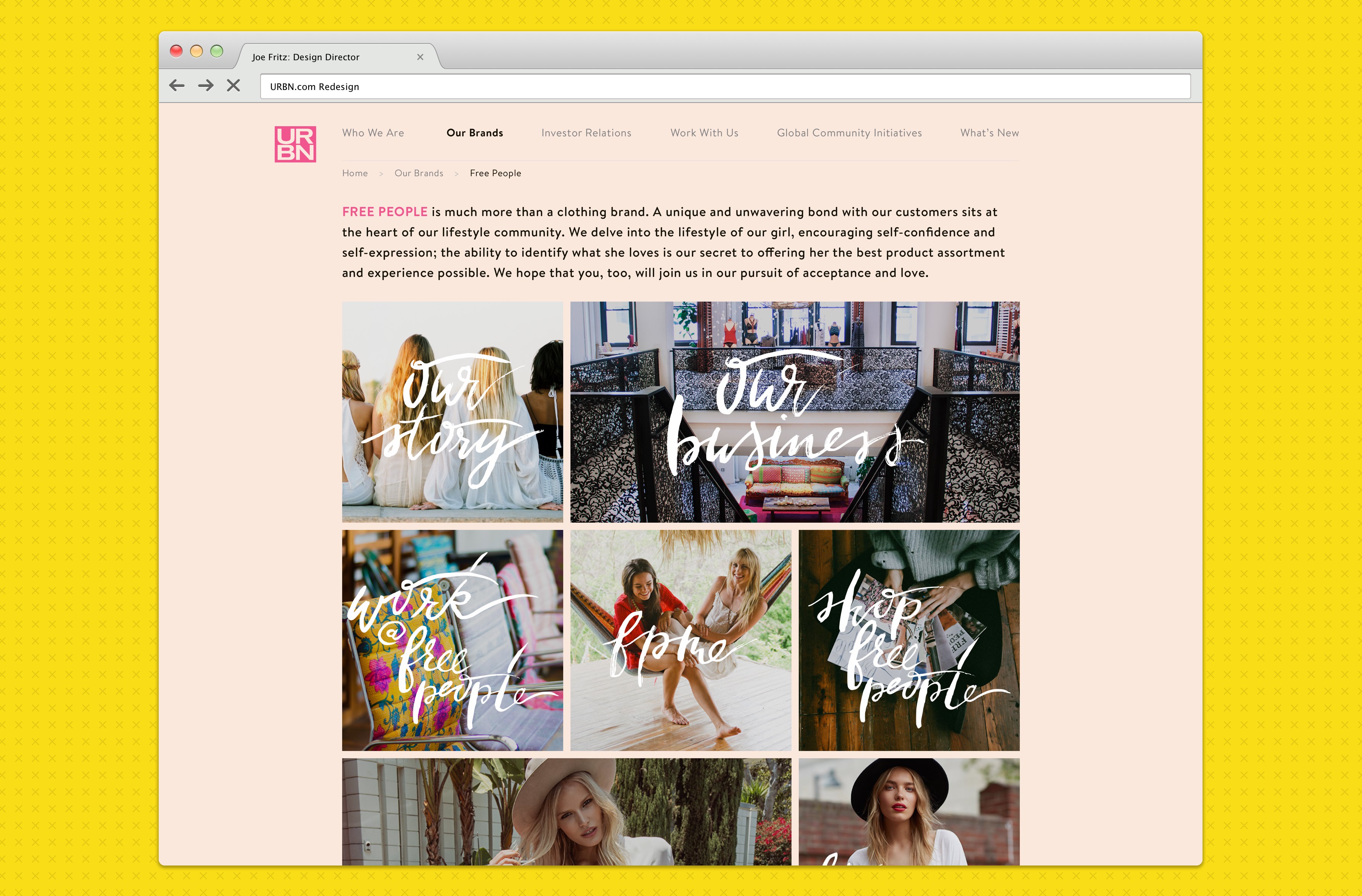
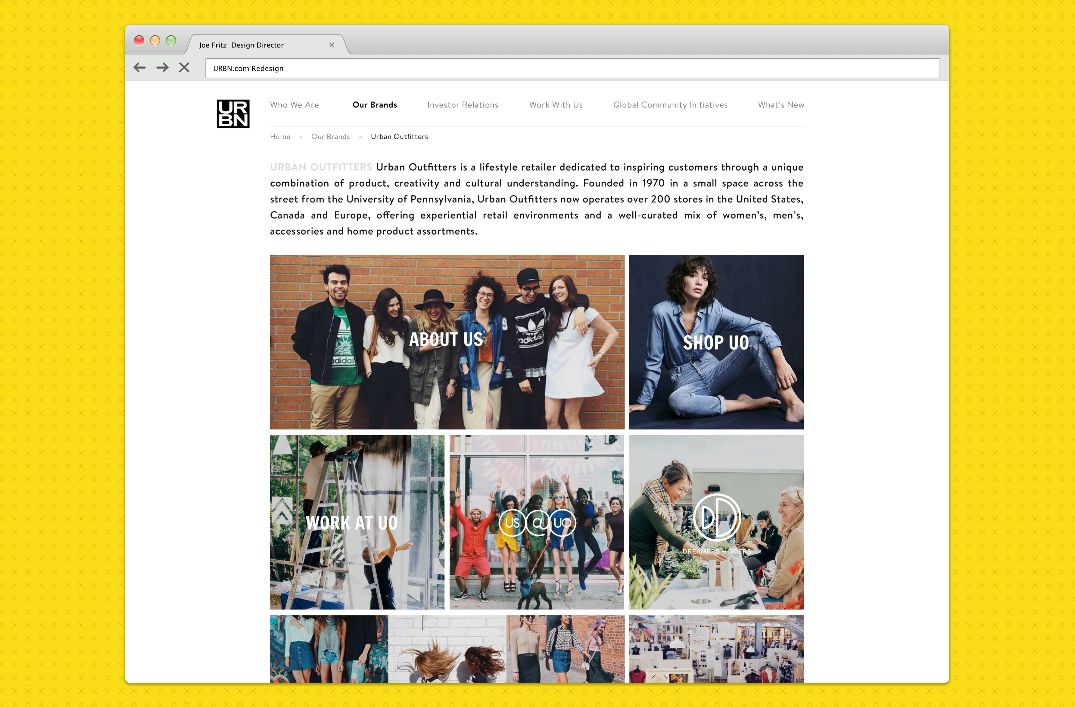
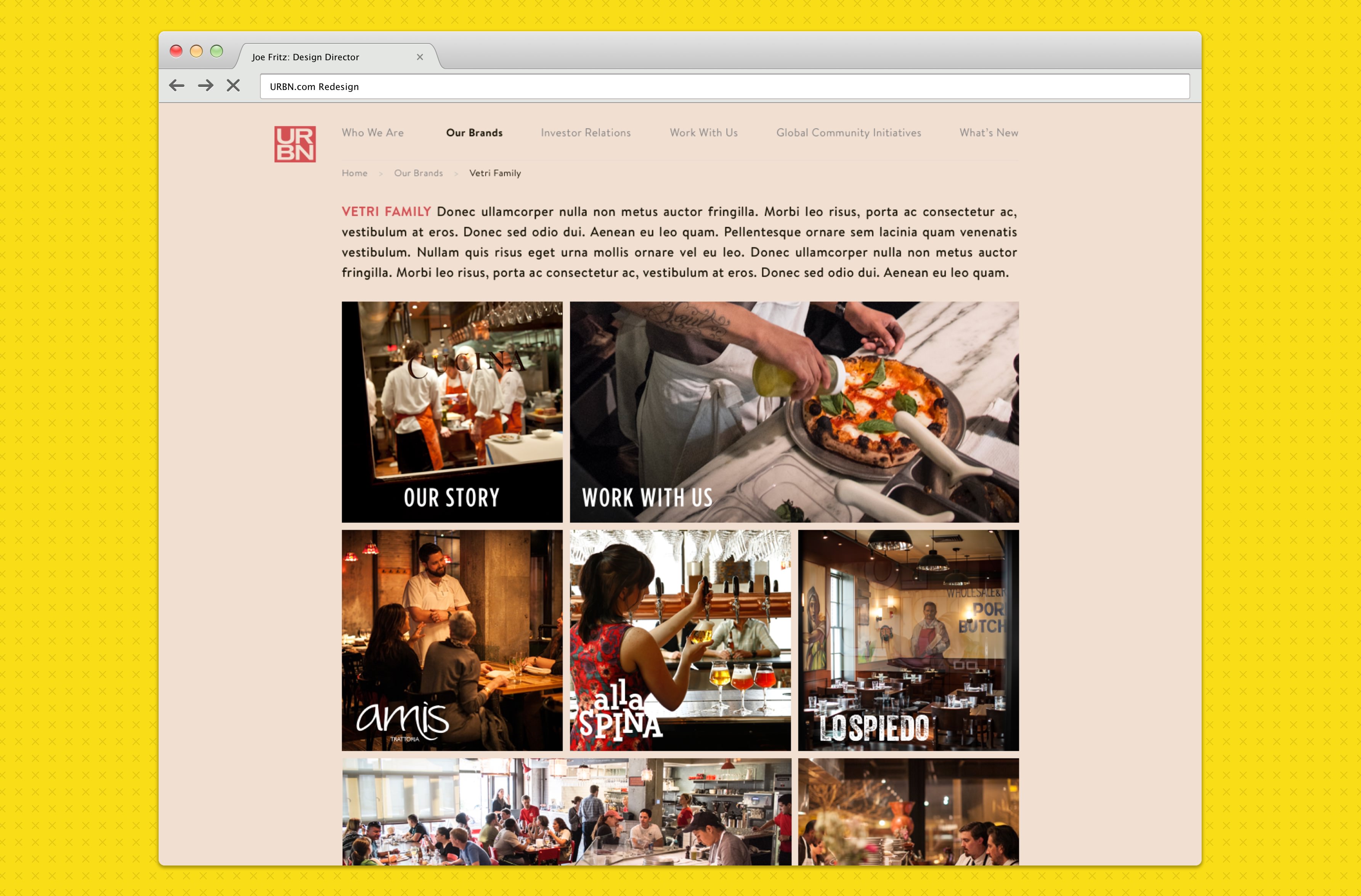
Using the company brand guidelines to inform color, font, and imagery decisions we mocked up every page in the site.

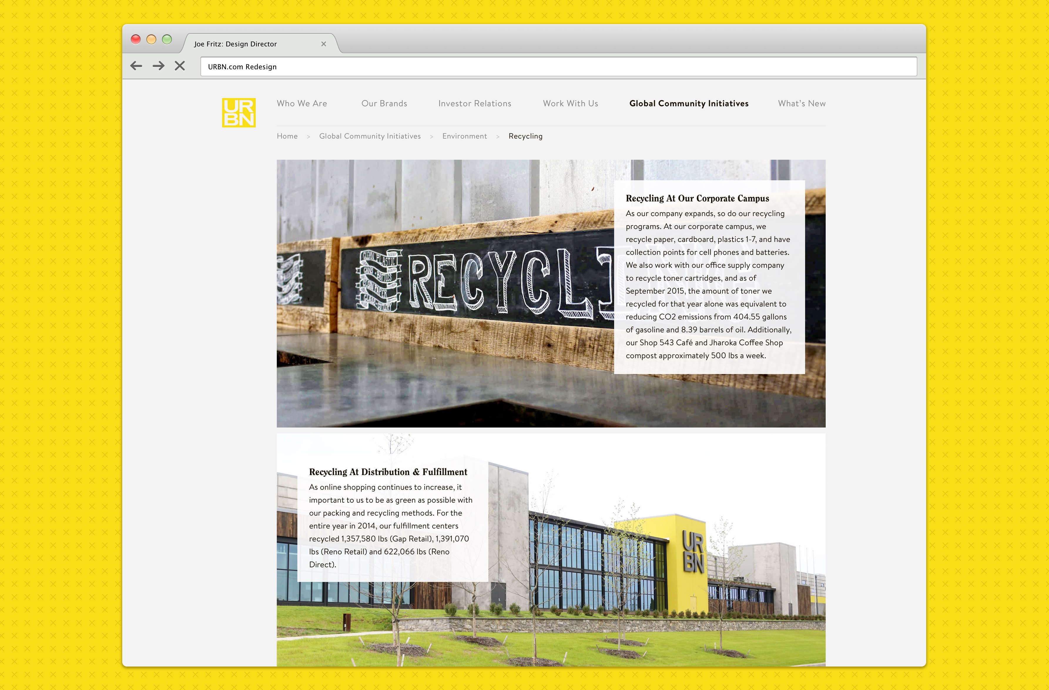
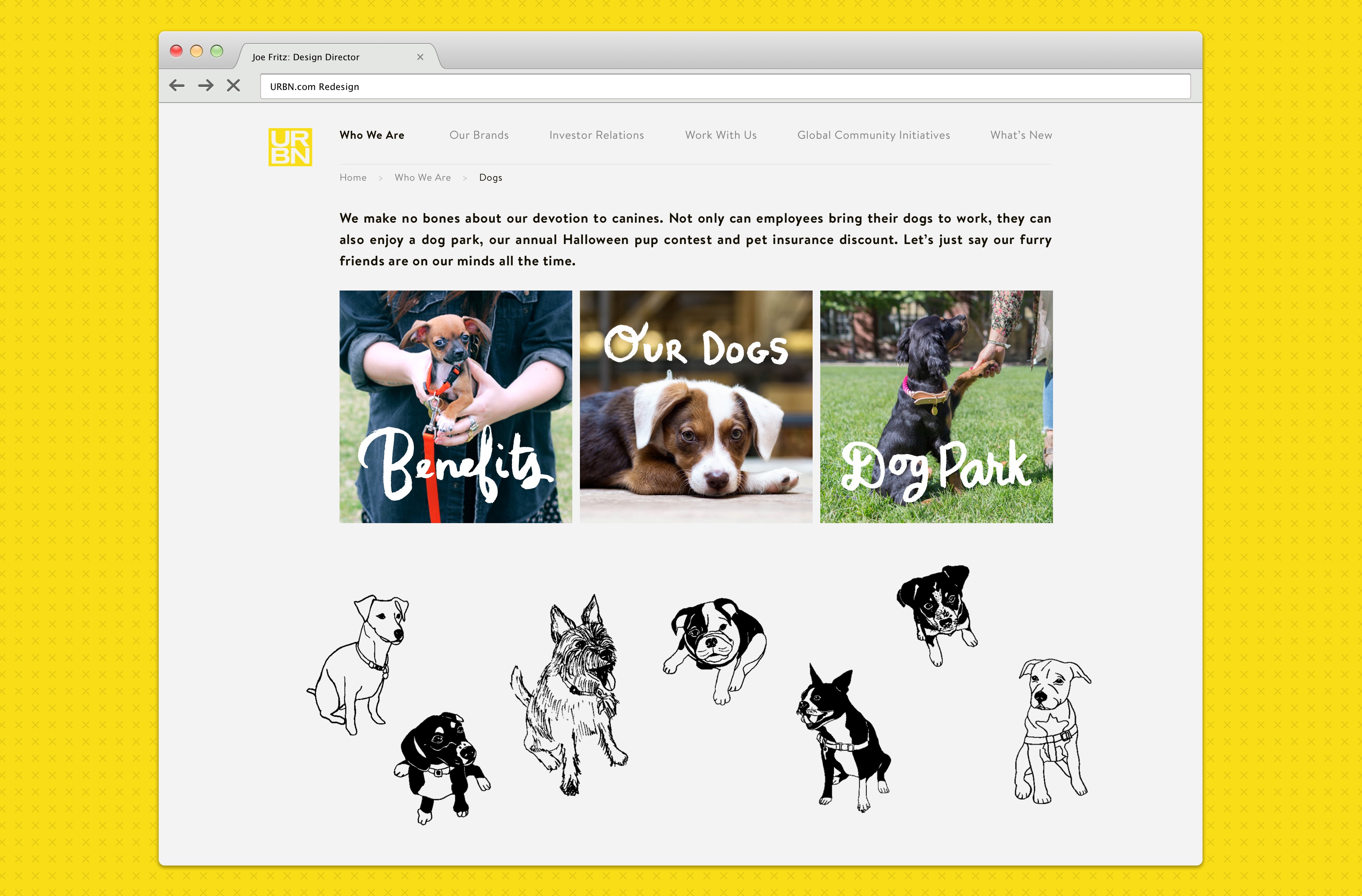
Responsive Design
In addition to working well on a desktop, URBN required a responsive “mobile” view as well. We carried over the desktop user experience to the mobile site with very few differences.
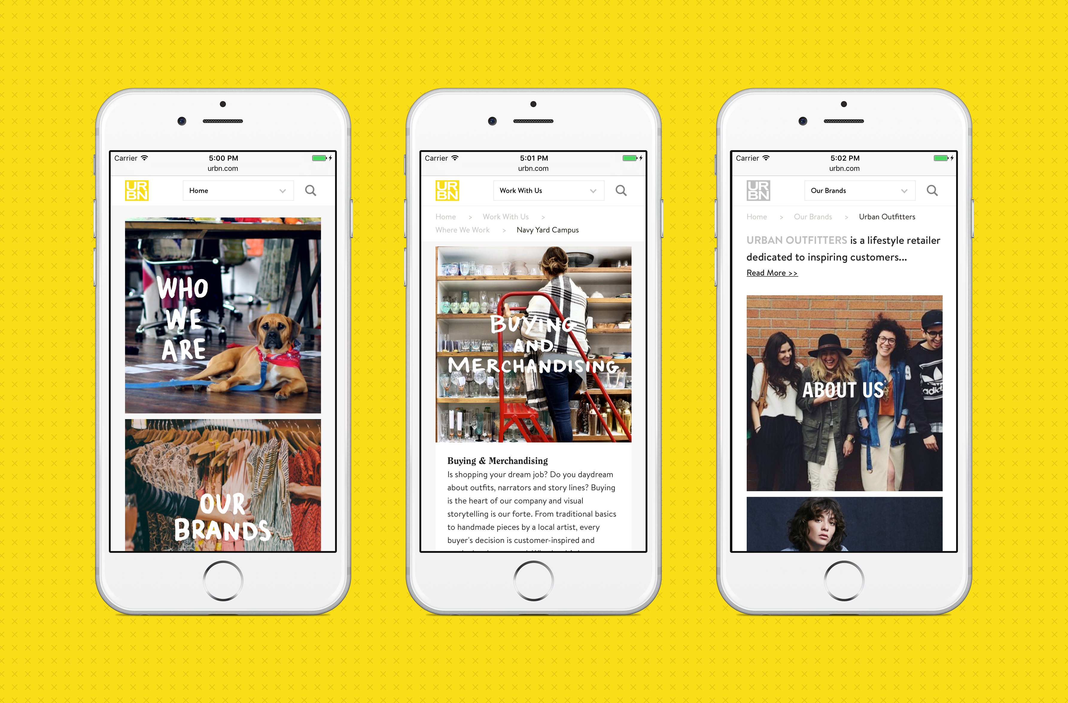
Whitelabeled Templates
Another interesting requirement for this design was that we needed to allow many different brands the ability to create custom “sub-sites” within the larger URBN.com environment. To do this, we created a selection of five templates that these brands could choose from to provide their own unique experience. This allowed them to alter fonts, colors, imagery, and grids without breaking the overall URBN.com aesthetic. Each brand used their own designers to fill in the blanks in the templates, and sent the results back to us to incorporate into the site.
Interactive & Development Specs
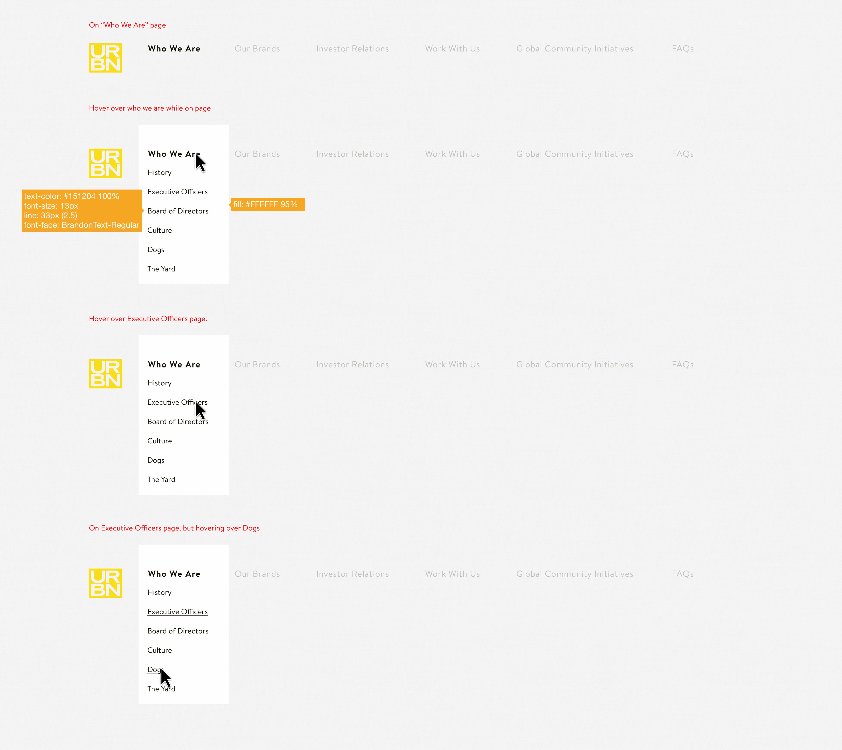
Because the site had a multi-tier navigation, with an out of the ordinary active state, we designed development specs for how the interaction with the header would work. We provided this to the front-end developers to build to.
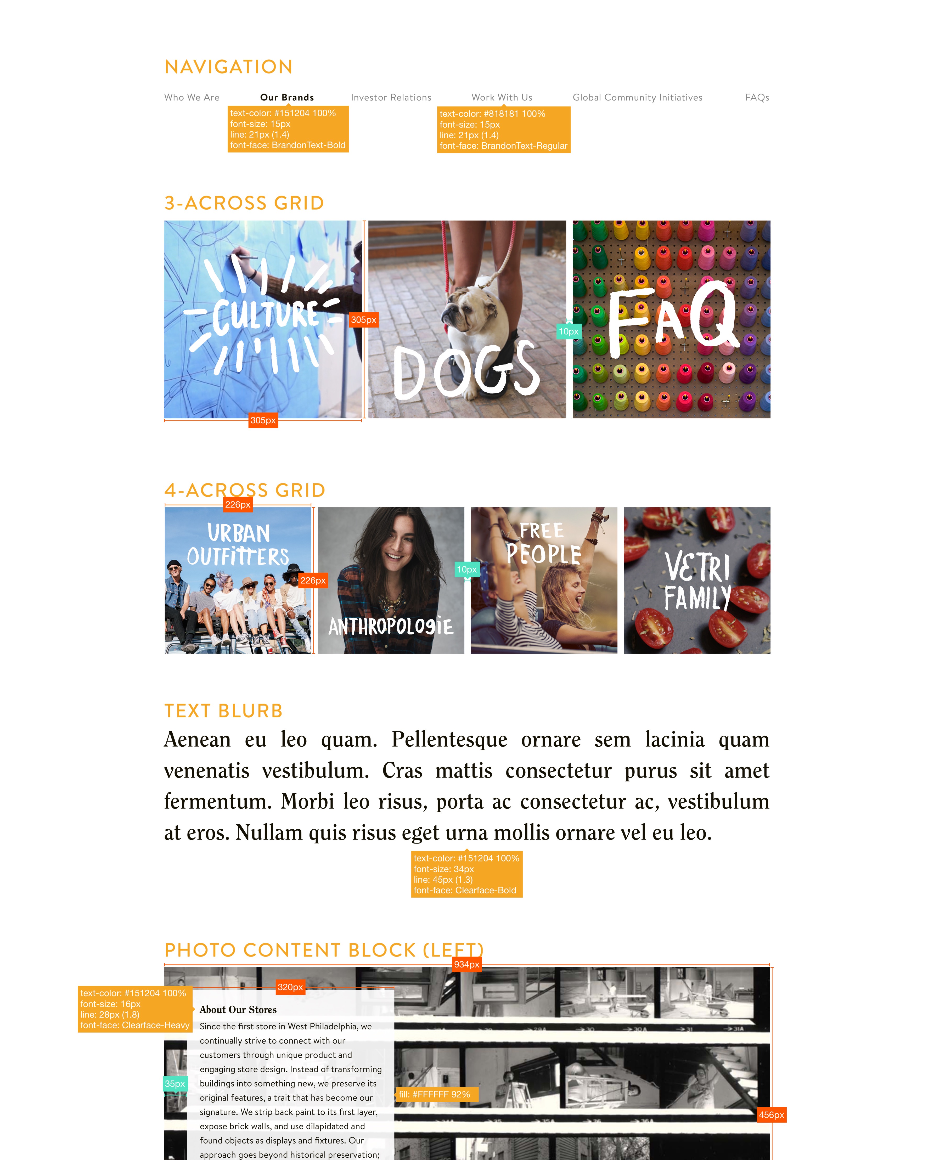
Along with interactive specs, we provided the front-end team with development specs, outlining the colors, sizes, fonts, ratios, etc. needed to build the site to match the mockups.
Launch and Reflection
We launched URBN.com in early 2016 and continued to design and build updates until mid-2017, when it was absorbed into and internal URBN development team’s duties. The response to the site has been great, and we’ve gone on to work with other URBN projects as a result.
