MyDealer
Mobile Customer Service and Administration
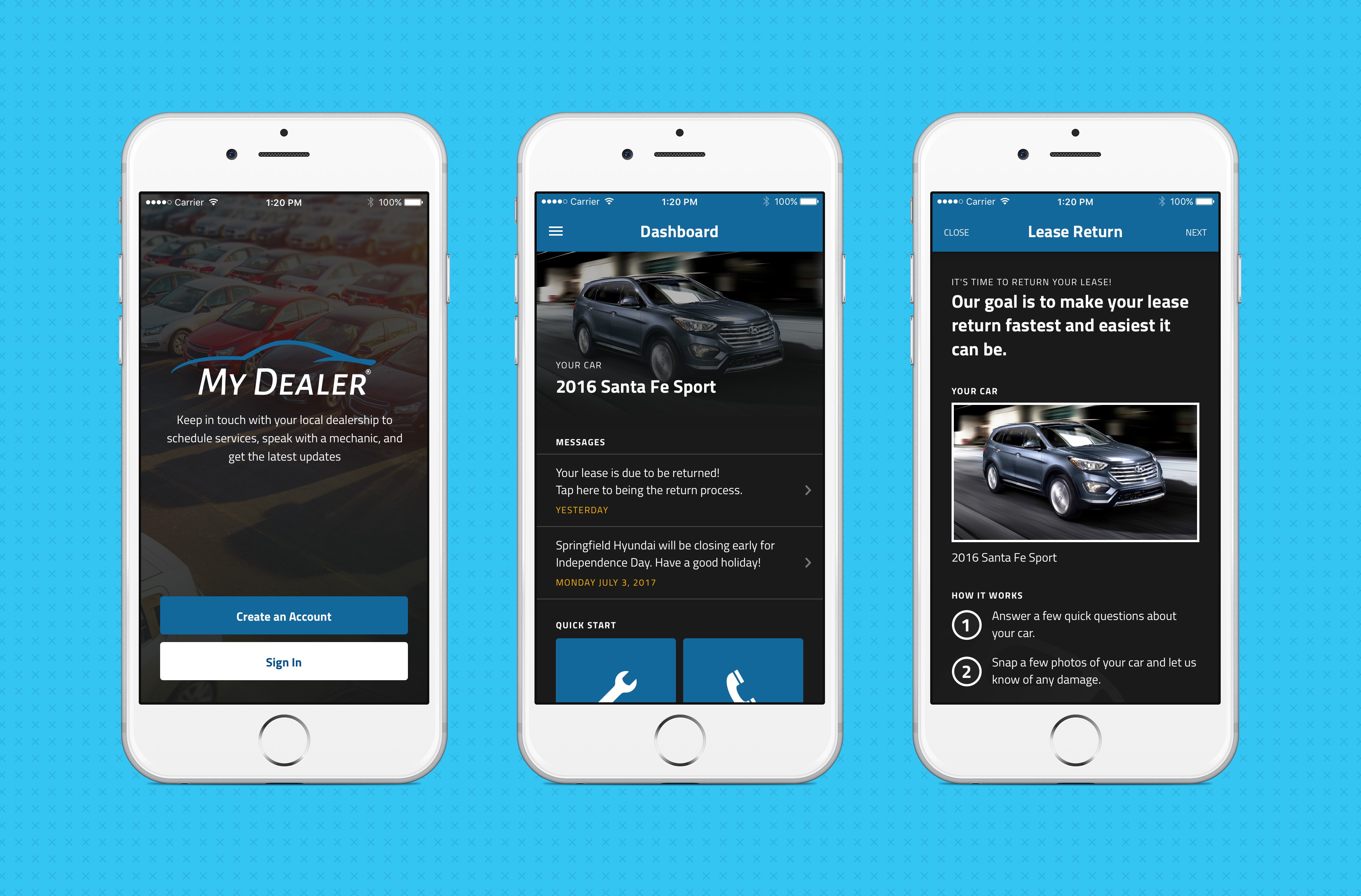
MyDealer is an app designed to allow car dealership customers a more constant point of contact when it comes to service, recalls, and lease information.
Context
Once a customer drives their car off of the lot, the dealership then has to start a long – many times manual – process of following up with that customer. When it comes to service reminders, recall notifications, or lease information, many dealerships have an arduous process when it comes to managing these types of customer communications. In addition, dealerships have an ongoing problem with customers returning leased vehicles with damages and not claiming responsibility for them.
Proposed Solution
Our client approached us to design a mobile application in which a dealership can communicate directly with their customers – and vice versa – to help eliminate confusing communication processes.
This system would allow a customer to link the application directly to their car by entering their VIN, the app would then know which dealership the car was connected to and provide a unique experience depending on what the dealership has provided.
Design Process
Branding and Inspiration
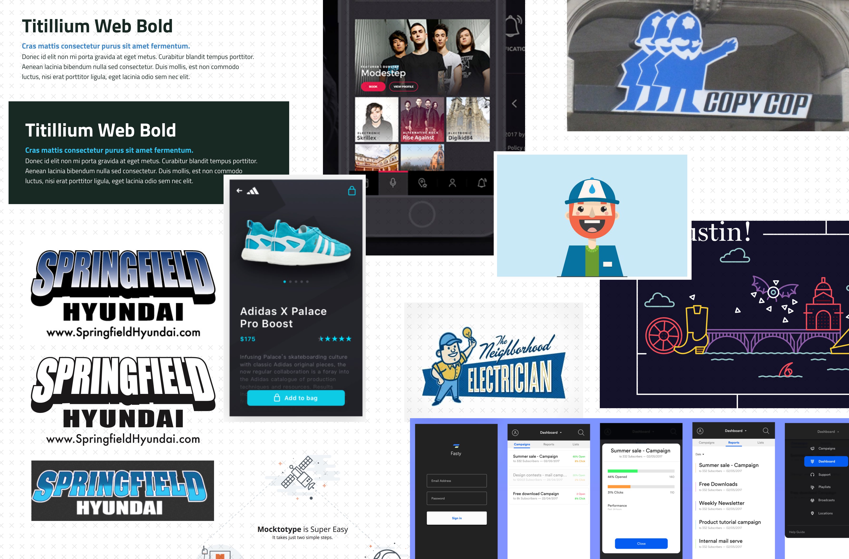
Using the logo provided by the client, we began by exploring a color scheme that would have the right feel for a “high end” automotive dealership. Ultimately we decided on a dark theme with blue highlights to create a feeling of confidence, and mimic the feel of driving at night with only a car’s console to light the cabin.

Along with choosing a color, we started compiling a moodboard for MyDealer. As you can see, at one point, we were experimenting with an illustrated mascot kind of character, which did not ultimately fit into the feel of the project.
Requirements Gathering
During the design exploration process, we also met with the client to discuss requirements. Working along with the client, we build user story maps, outlining the high-level goals of each user type (customer & admin), and breaking those goals down into smaller tasks.
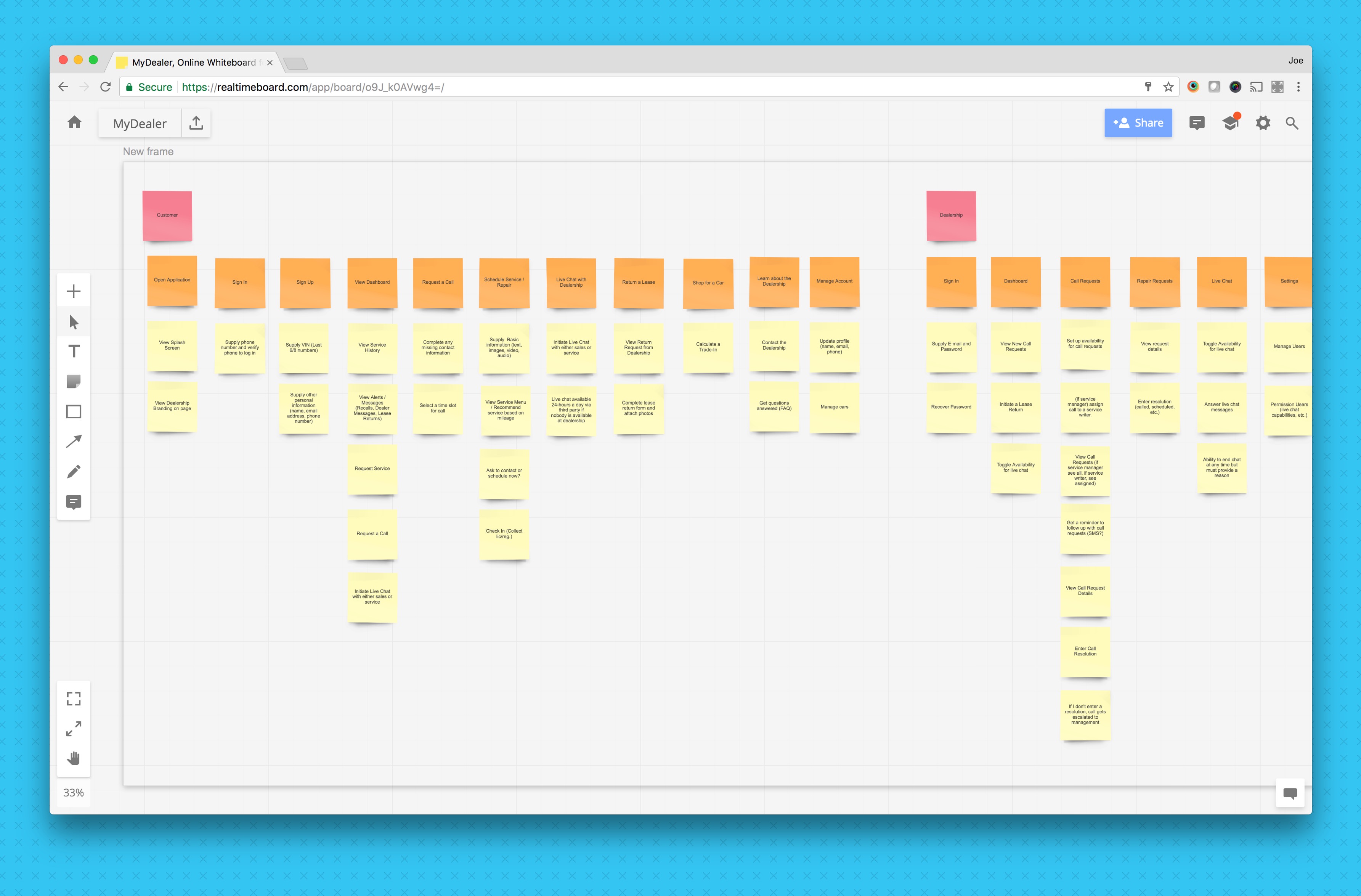
We used these user story map “tasks” to break the features down into digestible stories, which we used in our project management tool to help drive the project. Once all of the stories were documented and assigned, we began the wireframing process.
Wireframing
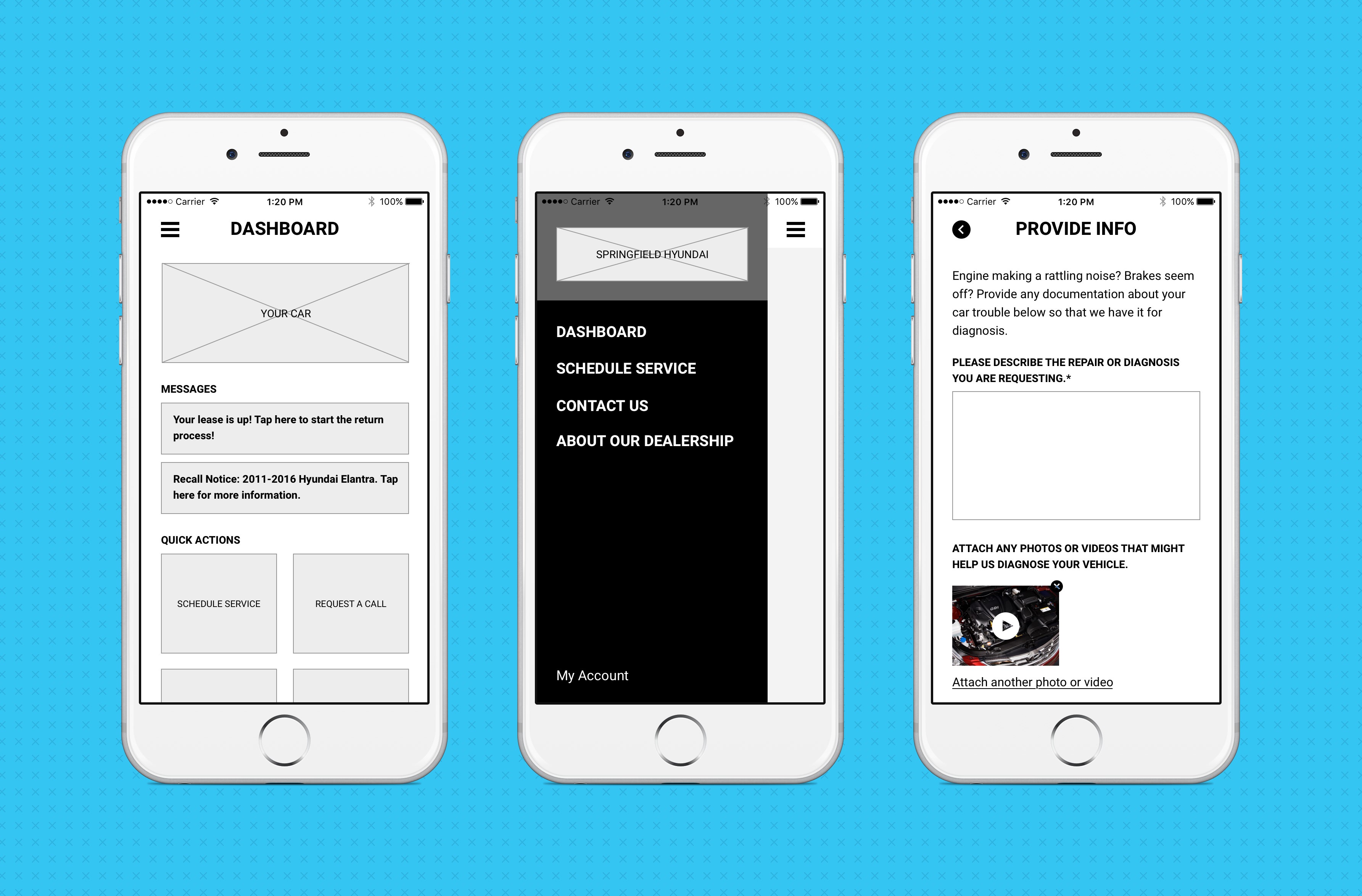
At this stage in the process, our goal was to have a demonstrable prototype as a basis for user testing. The wireframe would be devoid of any branding or visual design in favor of testing the feature set and user experience.
Mockups
Once our wireframe prototype was tested and finalized, we began applying the final design to the MyDealer. We started by developing a more succinct set of reusable visual elements (a styleguide), based on the color scheme and moodboard we assembled. These elements helped us to create a consistent design across the entire app experience.
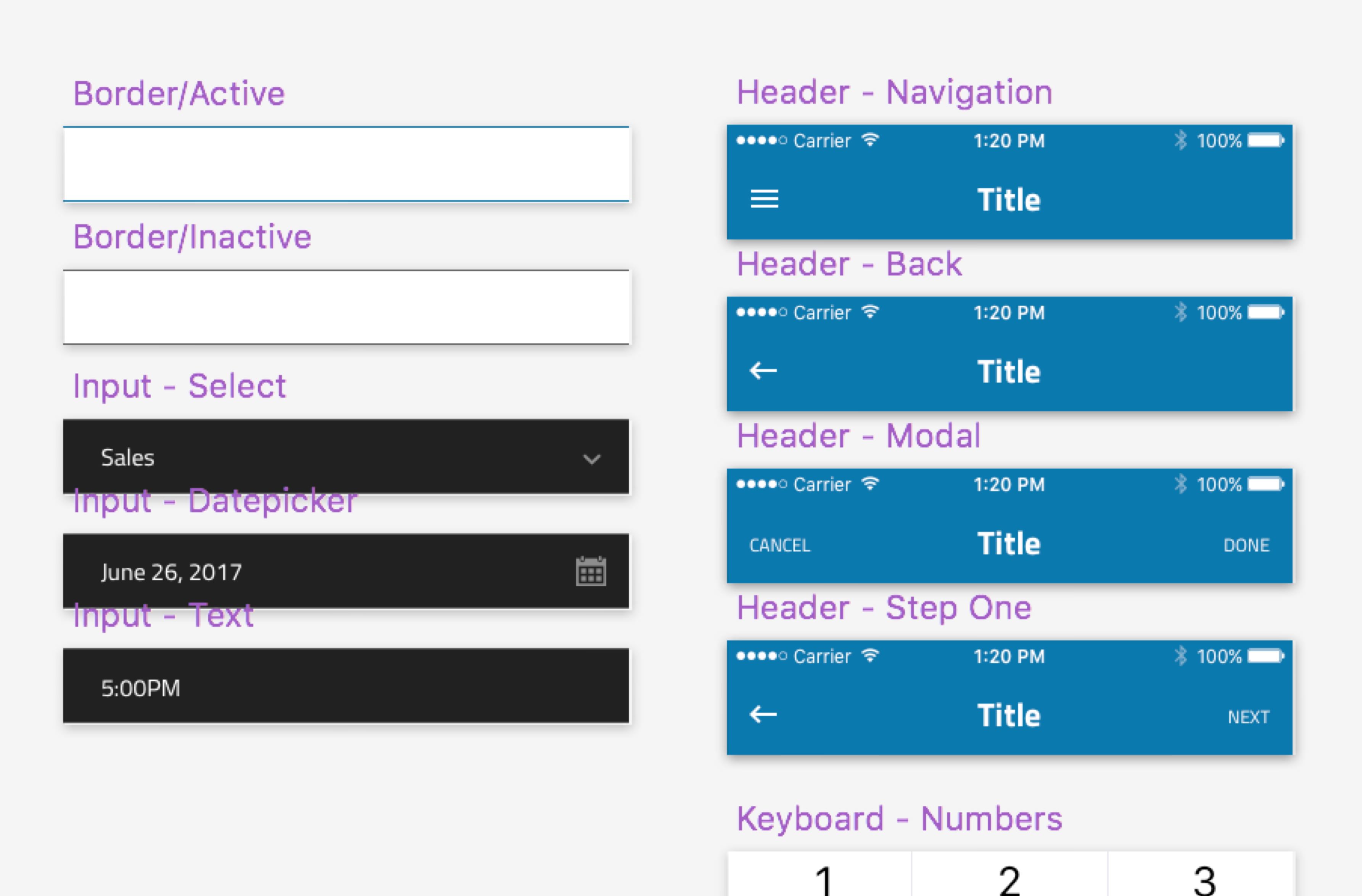
From there, we assembled a full set of mockups using these elements. These mockups were used as the basis for a development effort using React Native to create a great mobile experience for both iOS and Android.

Admin Panel
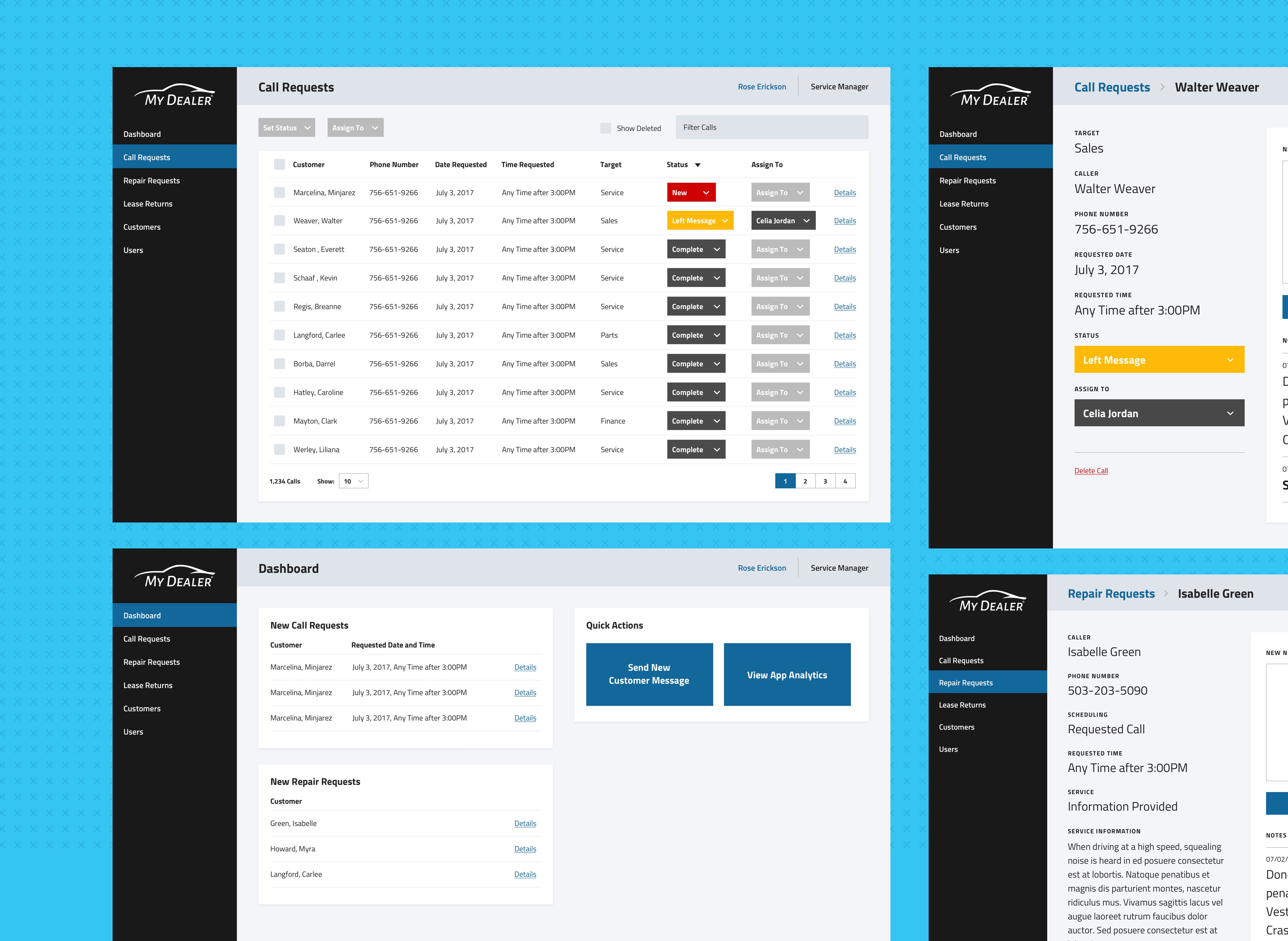
Along with the customer-facing mobile app, we built an admin panel for users at the dealership to interact with the customers. The design and development of this product followed a similar process.
Launch and Reflection
MyDealer will be launching later this year, and we’re excited to see it in the wild.
