GS1 US Data Hub Suite
The Global Language of Business
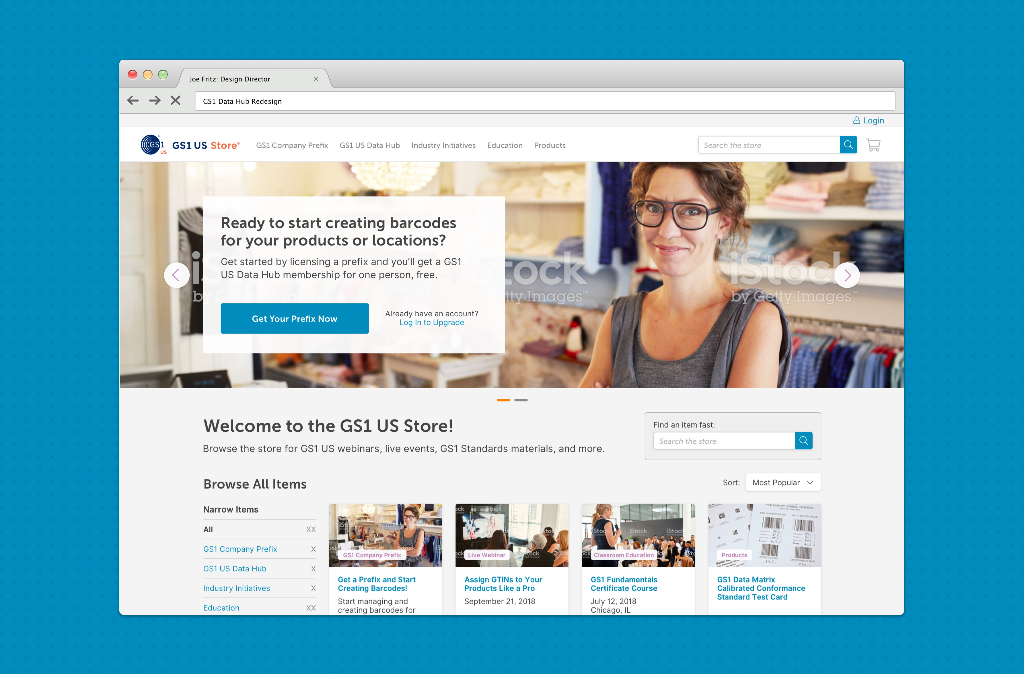
GS1 is the world’s leading provider of unique identification systems for businesses. Our team worked to redefine the customer experience of managing those systems.
Context
GS1 provides tools for customers to build unique identifiers to drive business processes. In short, that means creating and organizing barcodes and other identifiers for everything from point of sale to inventory and asset management. A large portion of GS1 customers are “entry-level” business users who were having a difficult time navigating and using the tools provided to create some of the most important assets to their businesses.
Proposed Solution
We were brought on to add design and development resources to GS1’s existing team and help reimagine the Data Hub tool to provide an experience that grows along with their customers’ businesses. We worked to provide easy-to-use onboarding and first-time guided navigation to help the newest users, while allowing for access to more advanced tools for long-time or large-scale users.
Design Process
User Research
Working with the customer support and business teams at GS1 we were able to identify a set of user archetypes for Data Hub. We looked at the types of customers using the current tools and identified usage patterns (number of times they’ve logged in, number of products created, etc.), and were able to boil the user base down into personas. These personas allowed us to customize different areas of the tool for different use cases.
Interestingly, we were provided with a few years worth of user “feedback” records which we were able to aggregate into recurring themes. This allowed us to pinpoint a few exact areas of improvement needed for redesign.
Journey Mapping
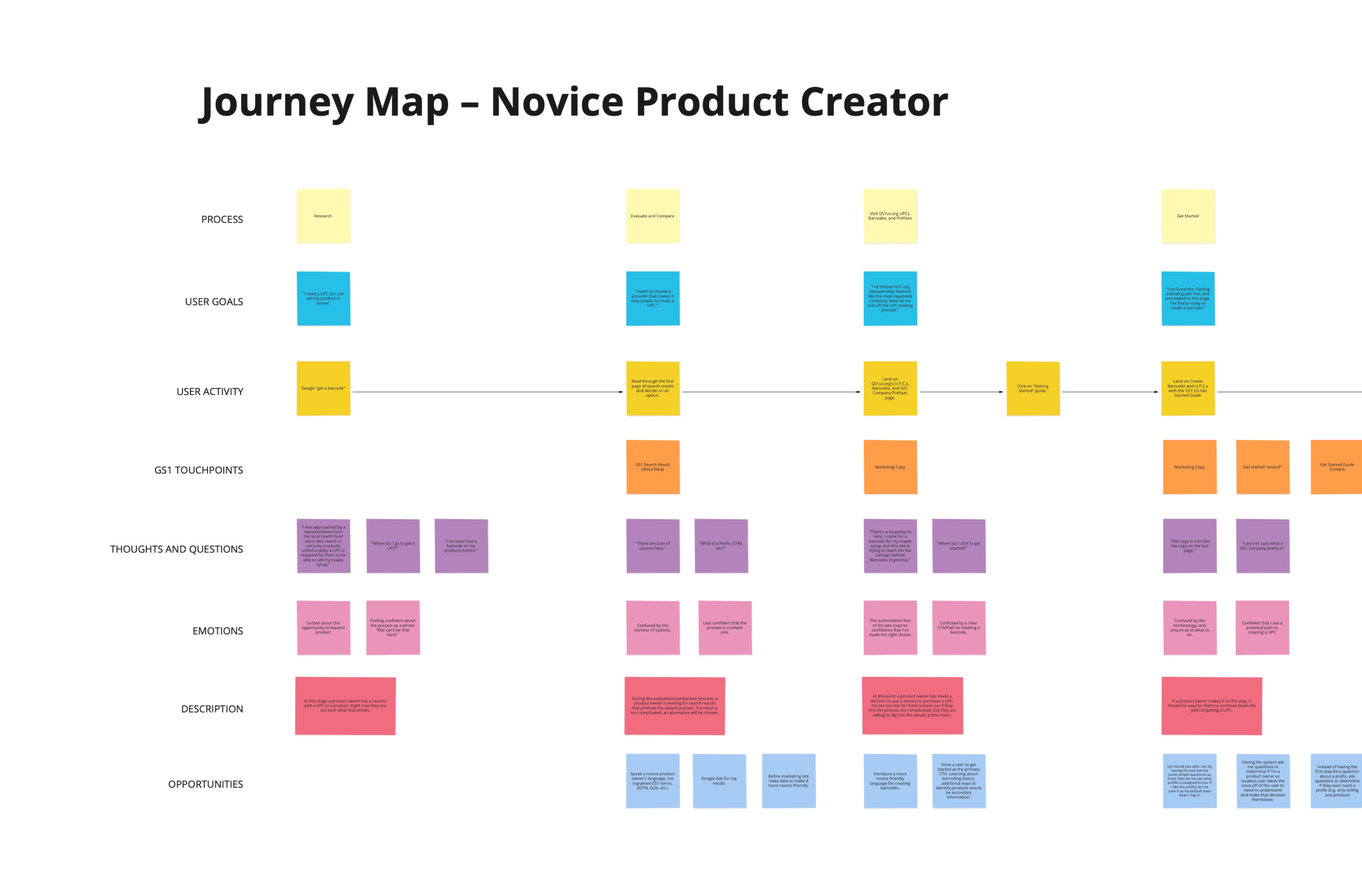
Once we knew who was using Data Hub, we were able to discuss with those users their journey through the tool. This journey map gave us insight to each user archetypes experience in using the current platform. We were able to identify painpoints in the experience, touchpoints between GS1 and their customers (whether it be by email or calls to support), and areas of inefficiency (why does it take so many steps to get through this part of the journey?). These journey maps helped us tailor the experience for those user groups with a real focus on building a great user experience.
User Story Maps
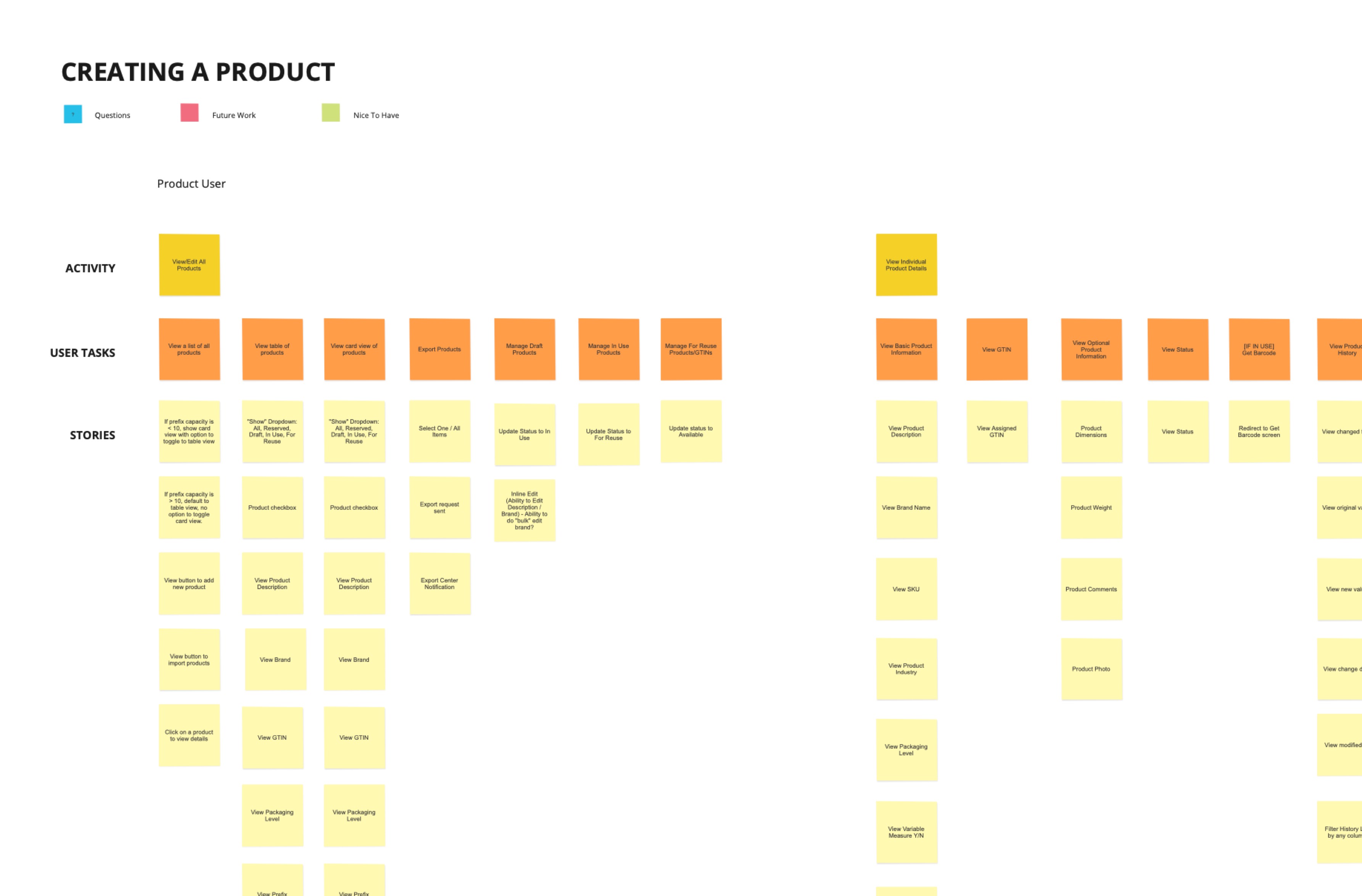
After we had identified the user base and their unique journeys (along with areas in which we could improve those journeys), we worked in a group setting to brainstorm what a great experience for those users might look like. We did this by creating user story maps. During this exercise we were able to break a GS1 customer’s experience down into tasks that they would perform to ultimately complete a goal. Using sticky notes as a platform for organizing these ideas, we made sure all stakeholders were able to express their ideas. This exercise helped to get everyone on the same page, and also helped the project management team build stories to be used during sprint planning.
Wireframes
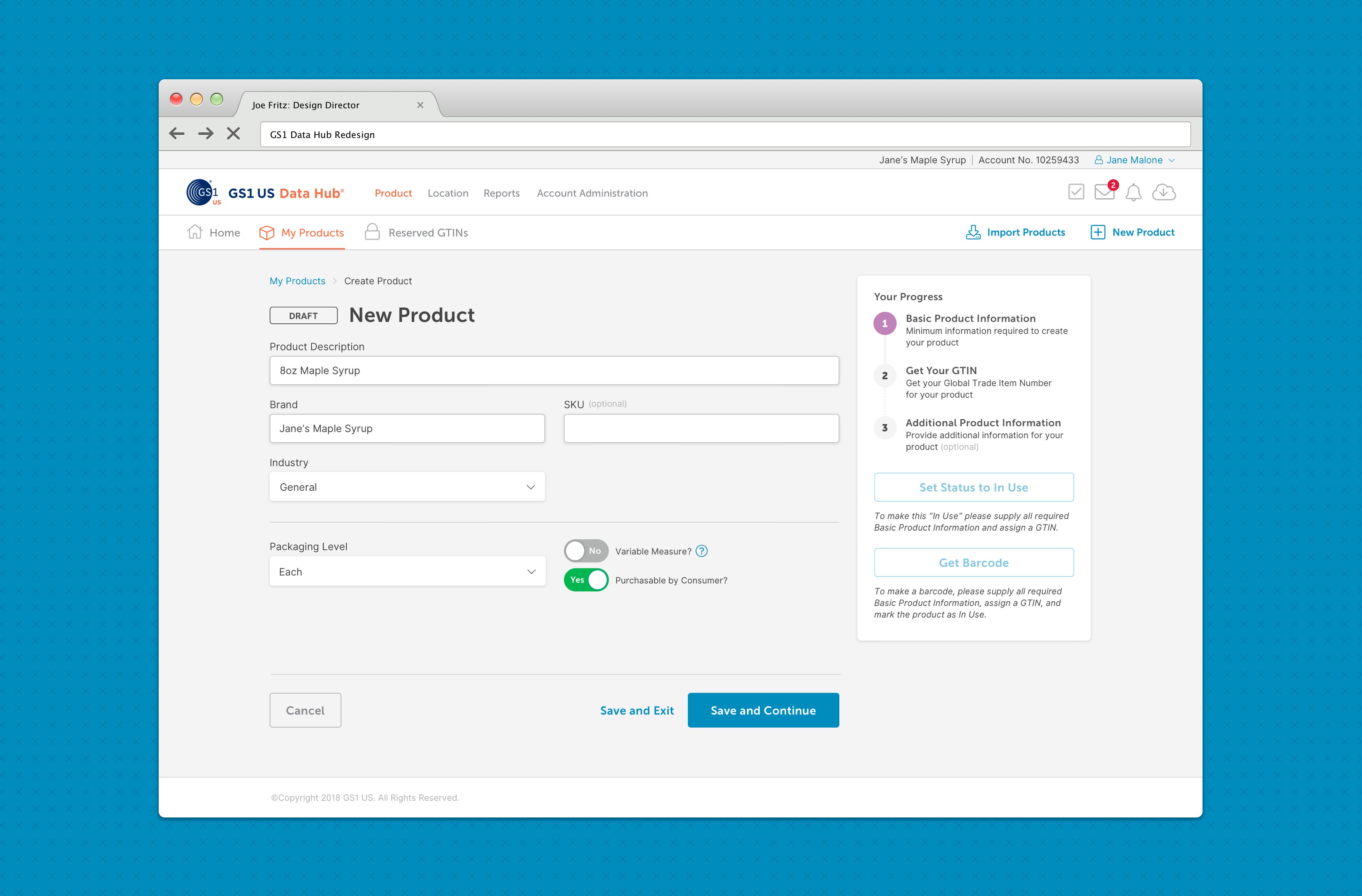
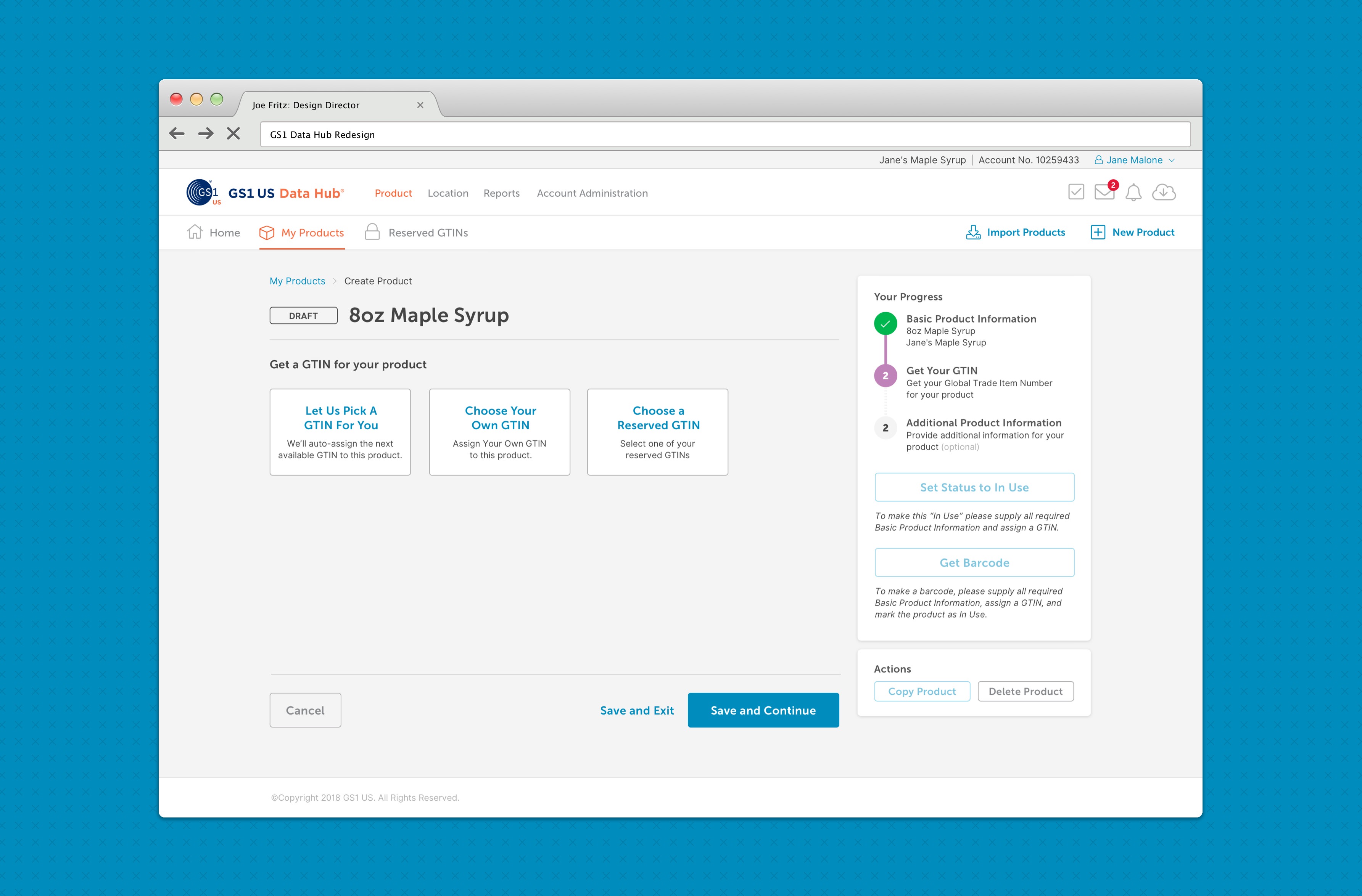
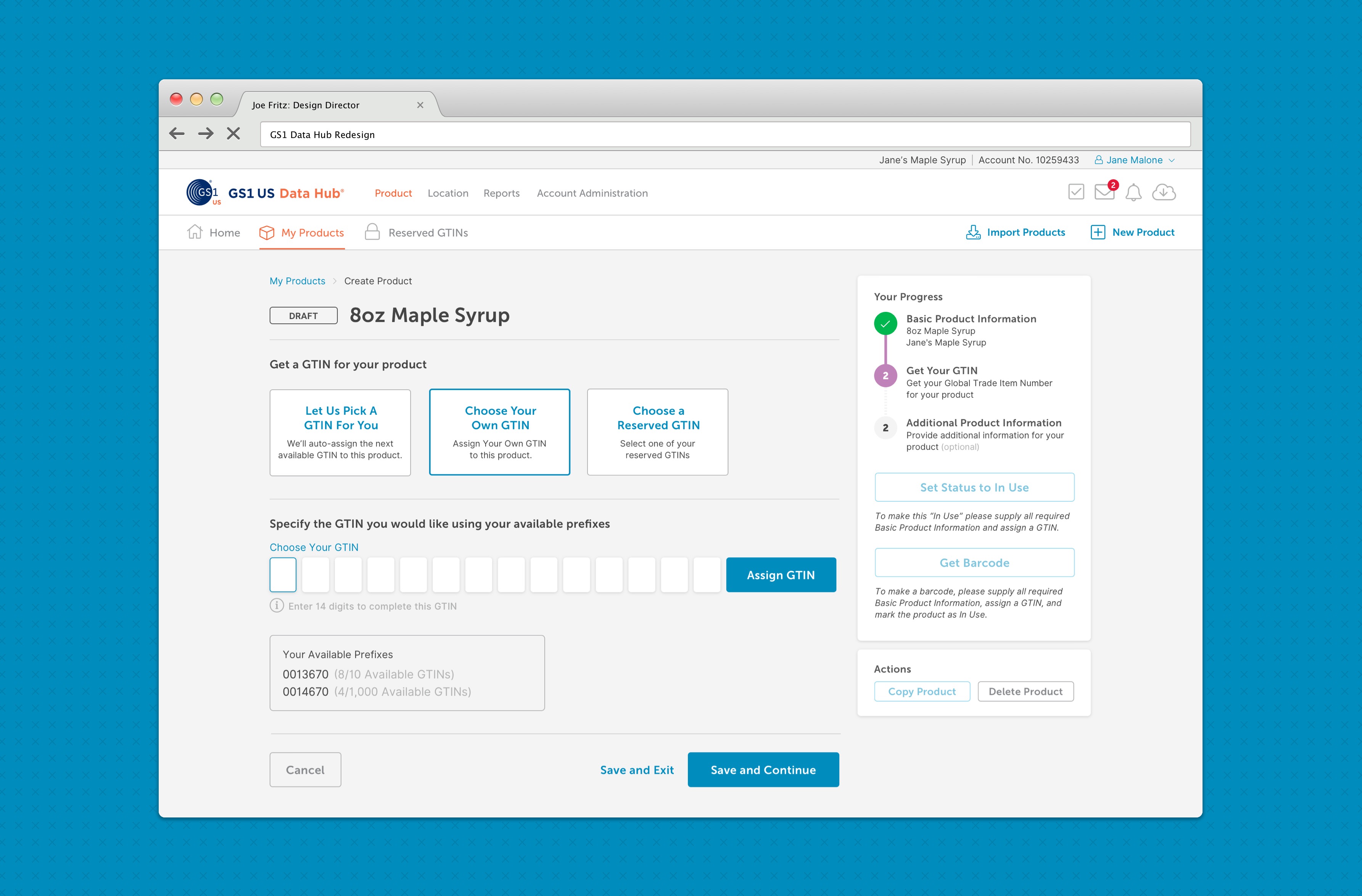
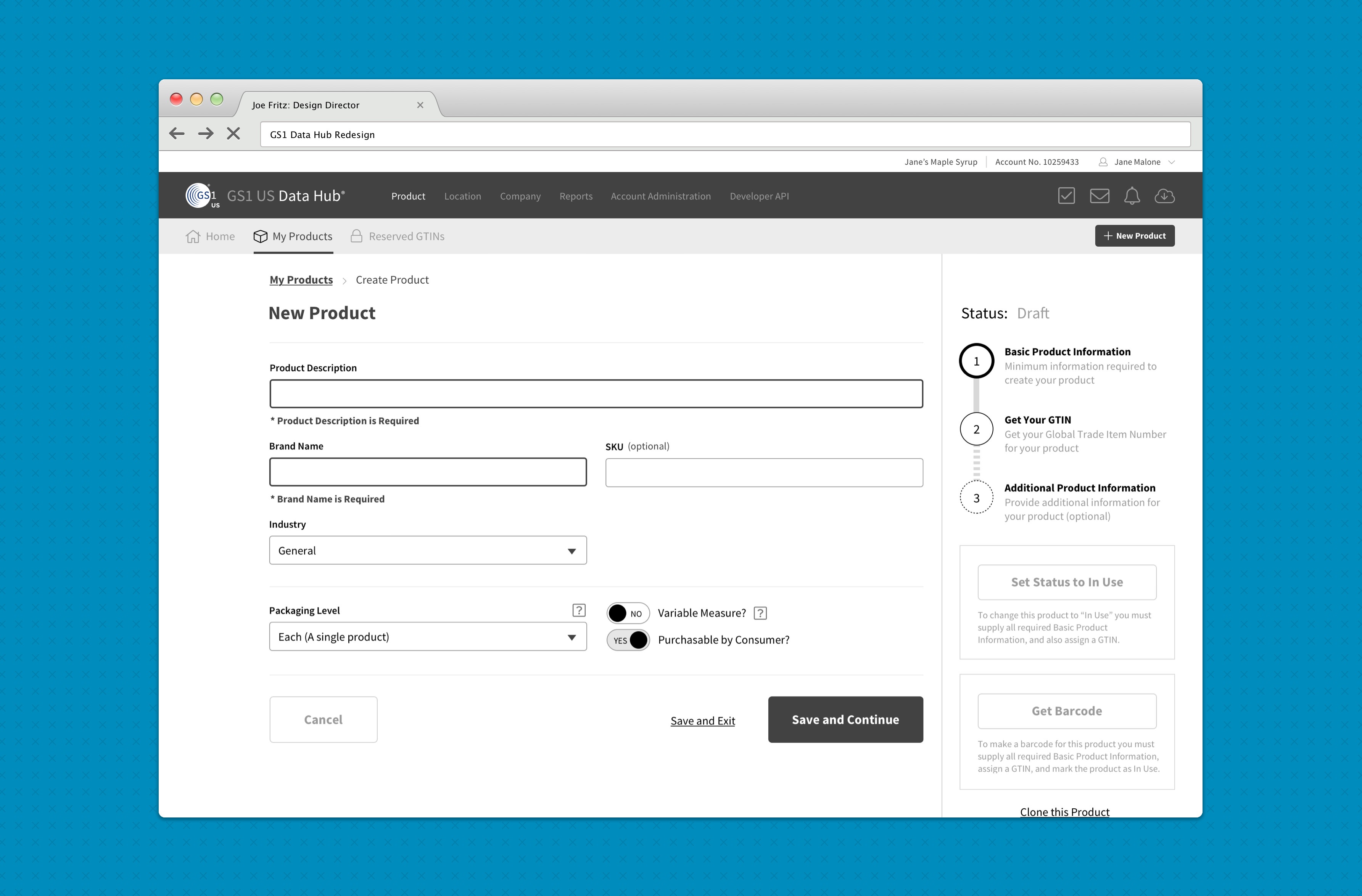
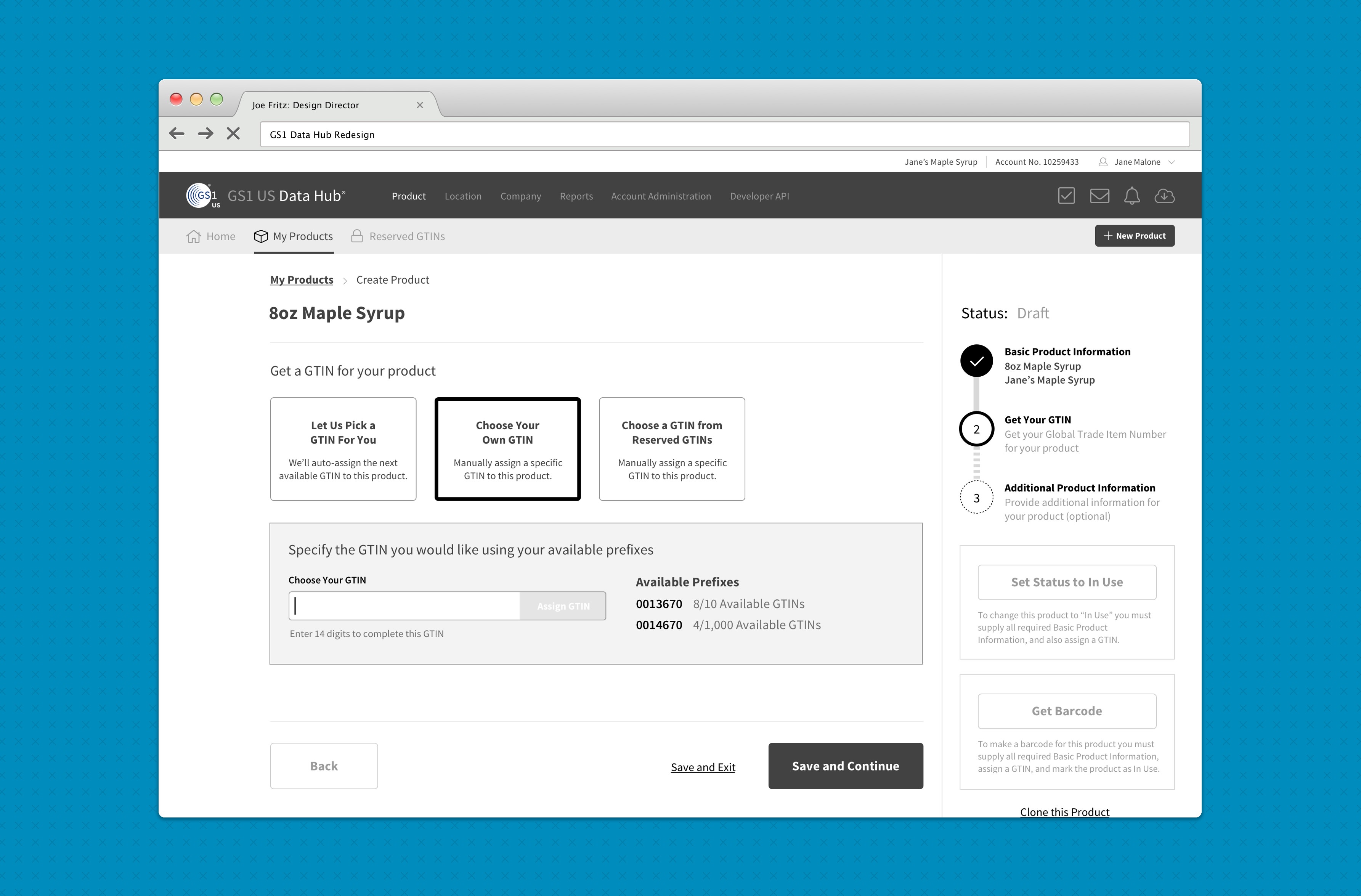
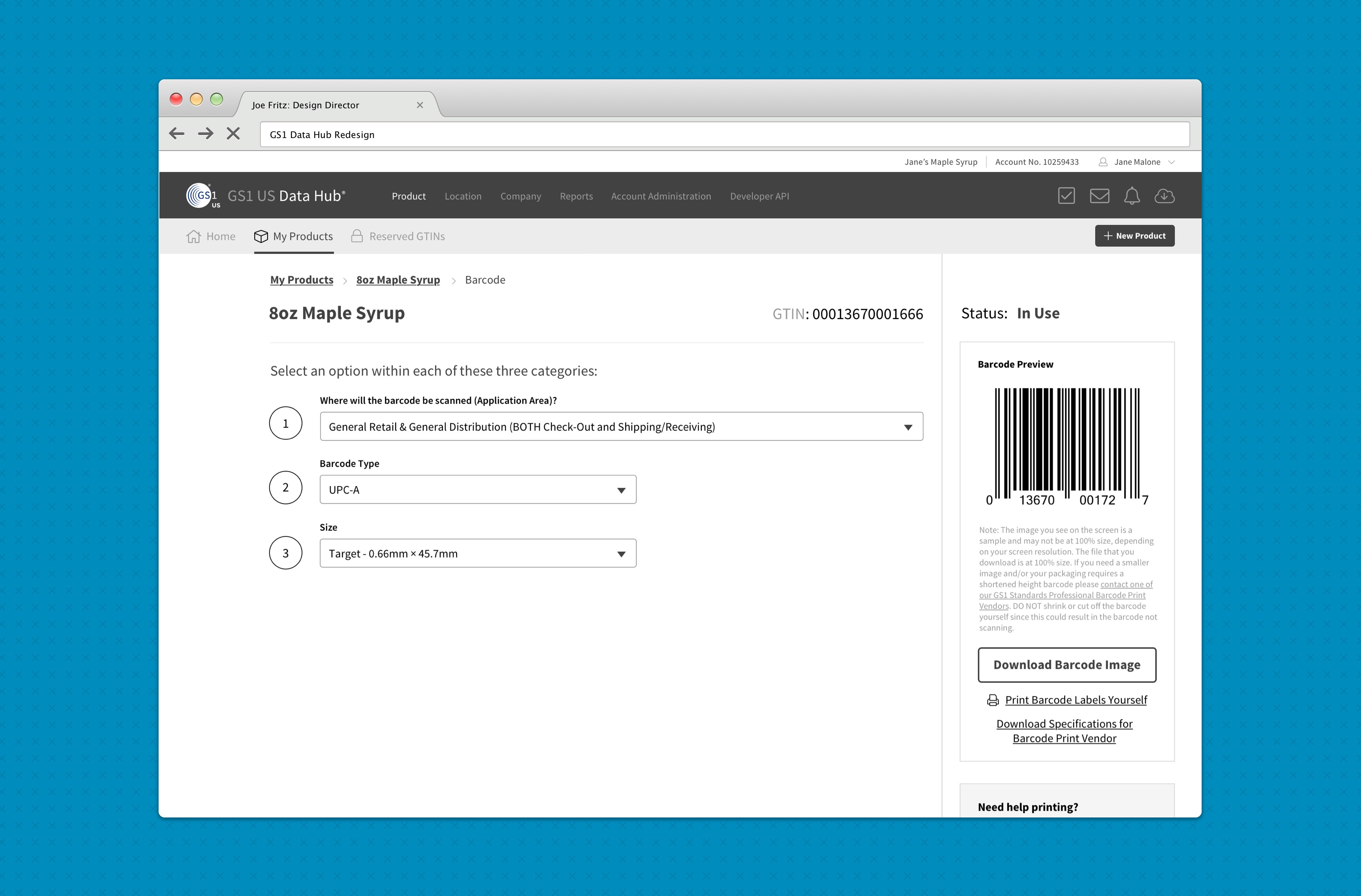
Working with an agile environment, we then set out to design each of the features in a demonstrable format. One that the developers could use to begin their work. Each sprint involved designing a set of wireframes to be used as a prototype for the features to be completed.
Design System
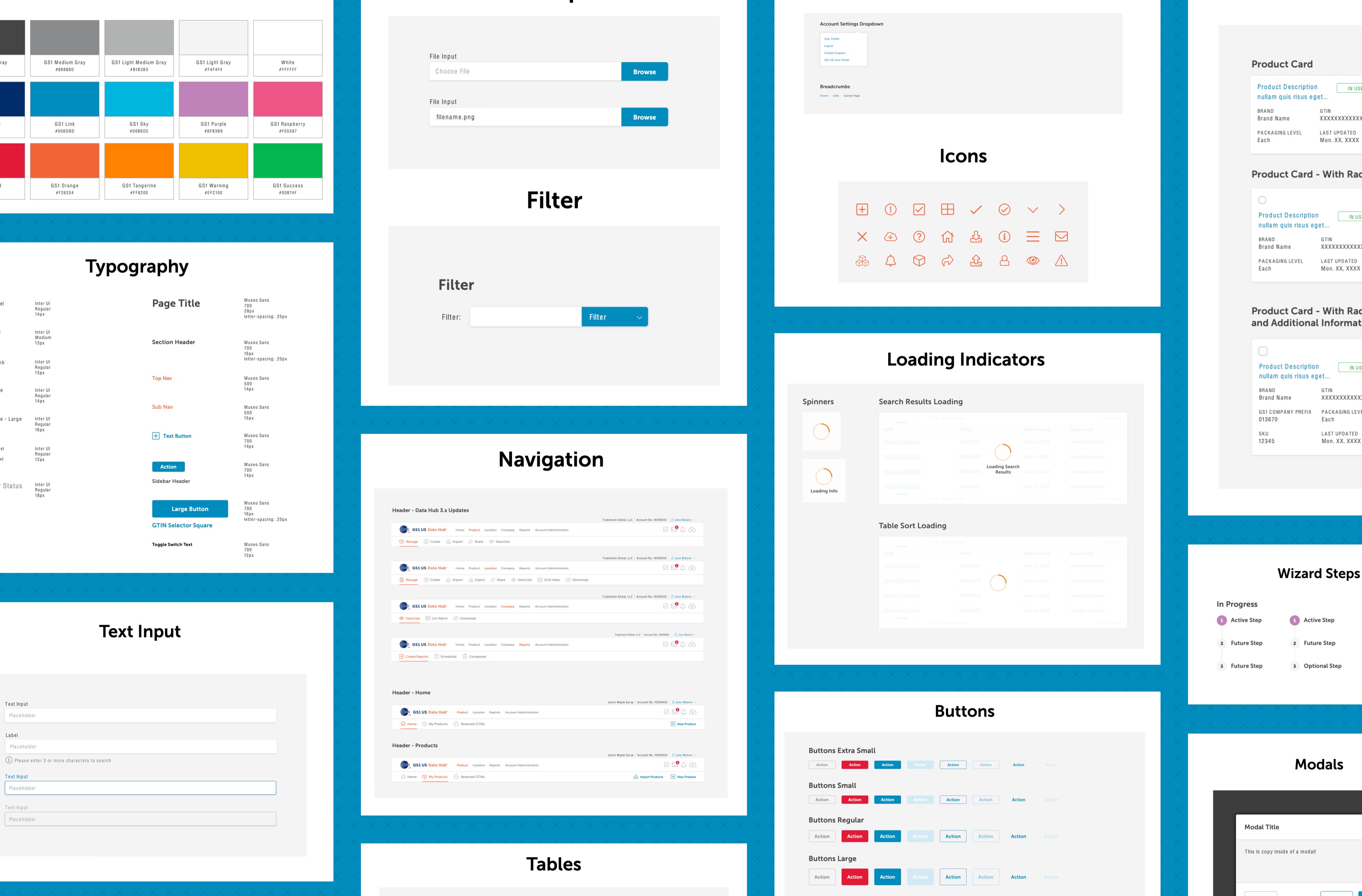
Because there were many development teams involved in building out various features, one of our first tasks was to create a design system and styleguide for all teams to be able to use to maintain consistency and ensure quality front-end development across all features. I worked with the front end teams to build this style guide and living design system (with reusable code) to be shared among all GS1 sprint teams.
Mockups
Once all stakeholders saw and approved of the feature prototypes, we were able to put the finishing touches on the design using the design system.
