Fulton Bank's Savings Genie
Helping Customers Save for Goals Magically
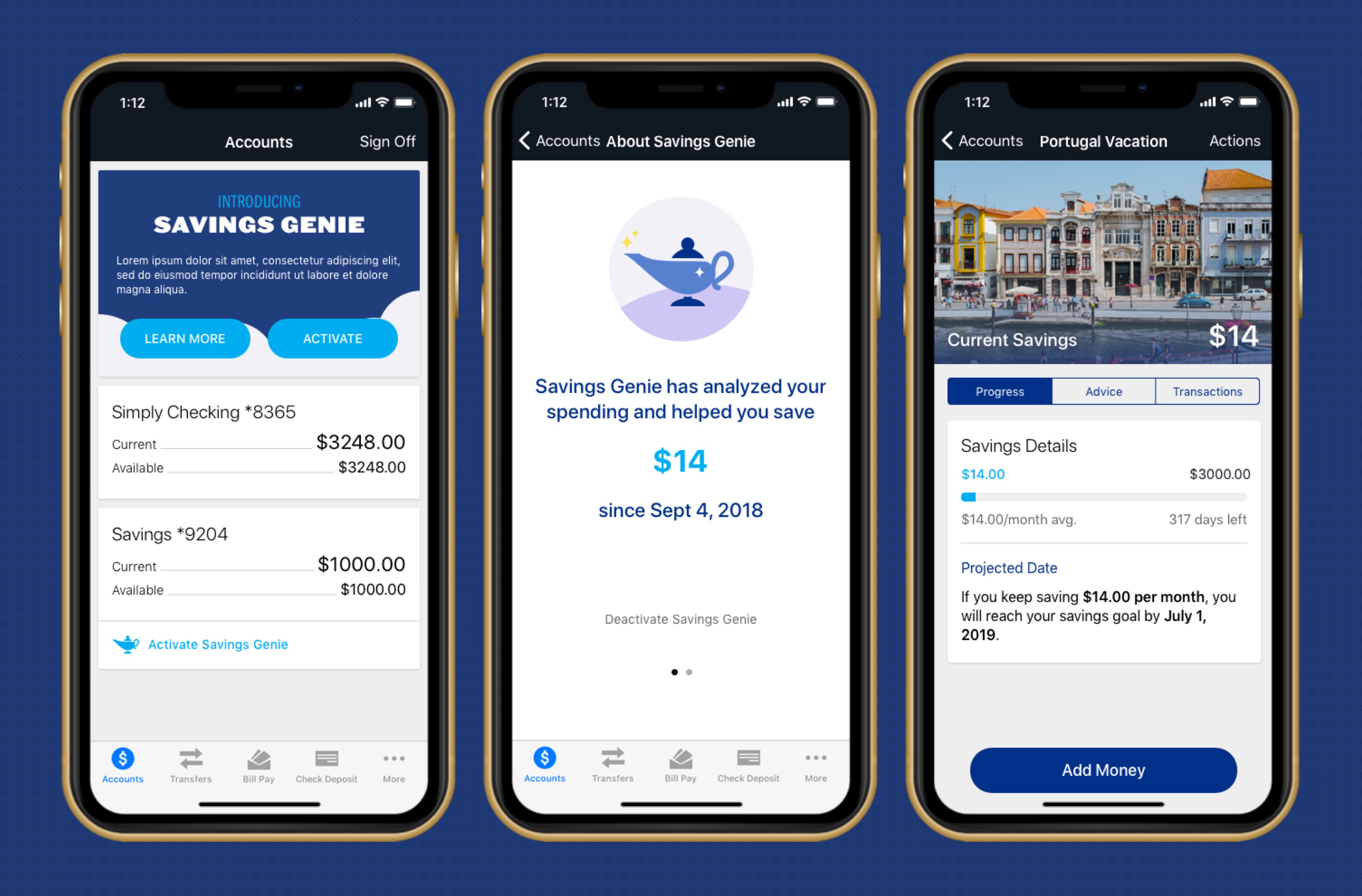
Fulton Bank’s Savings Genie is a smart passive savings tool to help customers achieve financial goals.
Context
Fulton Bank was looking for new services that would not only engage their current customer base but grow their brand with a younger more tech-savvy audience. Their suite of online banking tools was performing well with customers, but wasn’t harnessing the potential of their data. Fulton realized there was an opportunity to be a proactive savings assistant for their customers and wanted to build a tool to achieve this goal.
Proposed Solution
Working with the business and product teams at Fulton, we proposed an approach to designing a native mobile and web based application built around a Design Thinking process. With the intent of building a tool to help users define savings goals and passively work towards them, we would brainstorm with stakeholders at Fulton to identify ideas and priorities, and then talk with potential users to discern where an app could fit into their financial lives. This process would assure we’d be designing and building an app that customers would actually want to use.
Design Process
Stakeholder Brainstorming
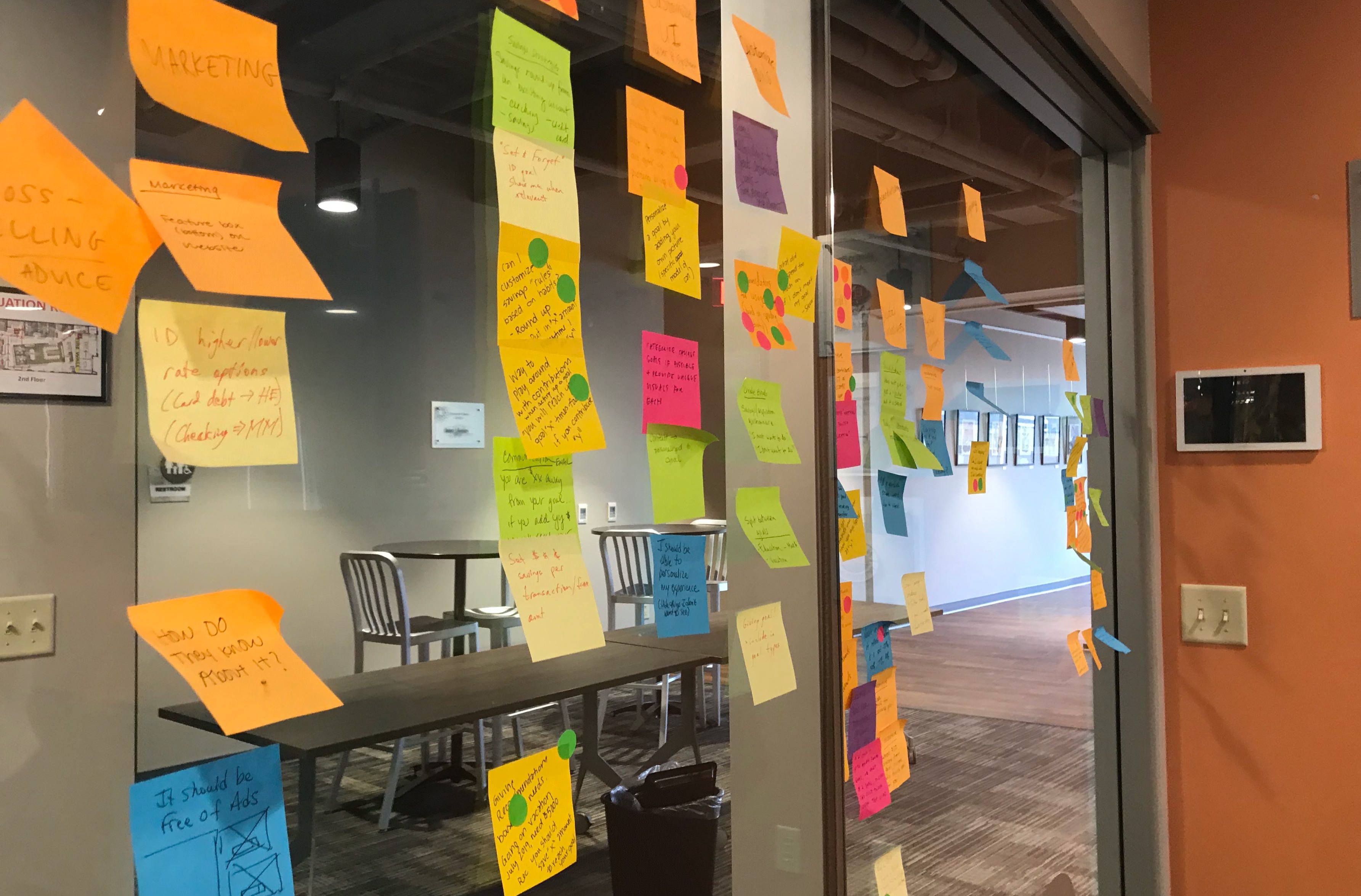
We met with a team of stakeholders made up of business leaders, technology advocates, and other designers at Fulton Bank to brainstorm. During this session all members of the meeting were able to discuss and express their ideas for the app. We then ranked those ideas in terms of priority by individually voting on them. Ideas that received the most votes would be prioritized the highest in the development plan.
This experience not only gave all members of the Fulton team a voice in the design process, it helped to get everyone on the same page when it comes to priorities and vision for the application.
Wireframes
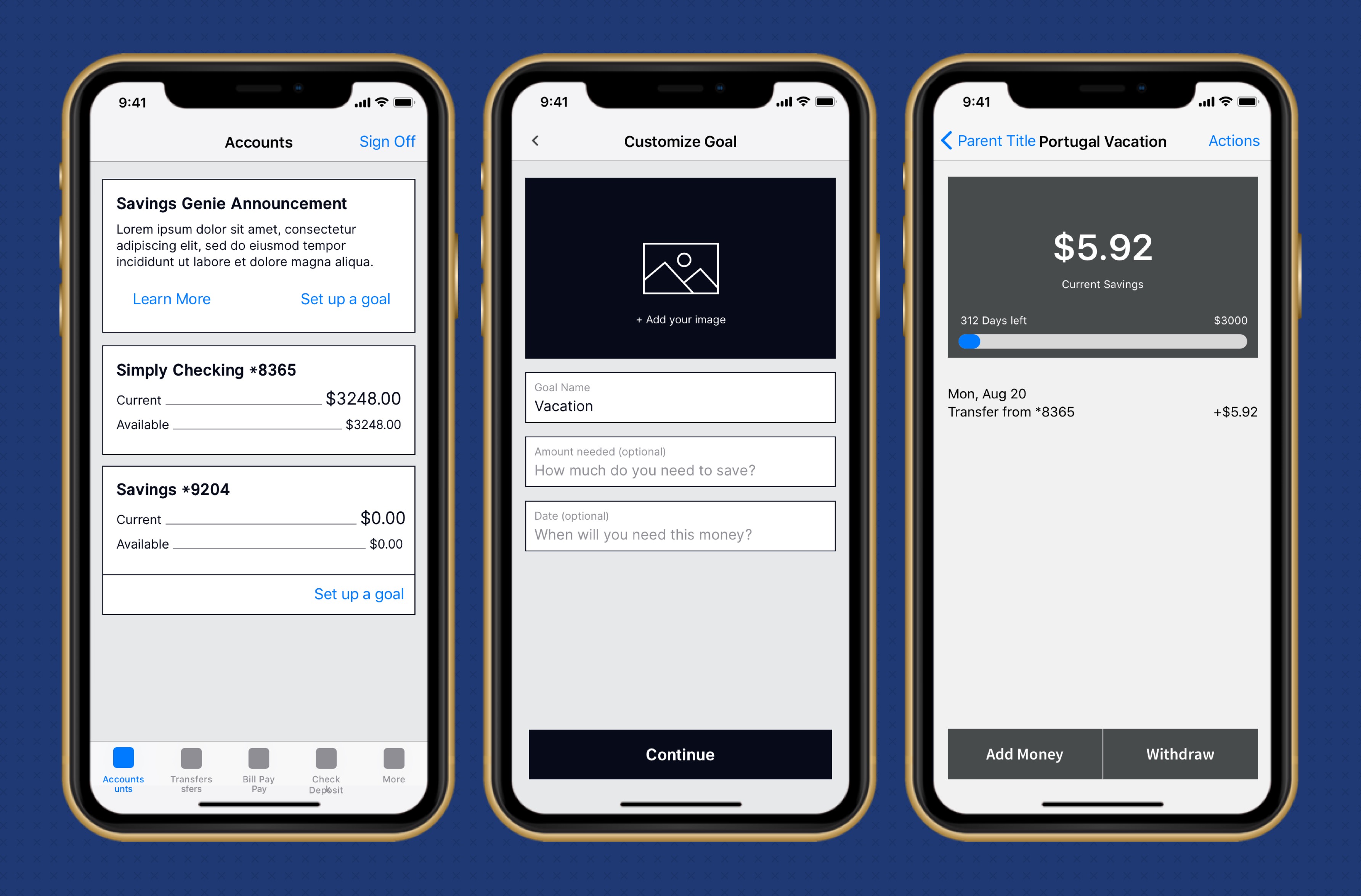
The first step after building our list of priorities was to create a wireframe prototype of what the experience could be.
User Testing
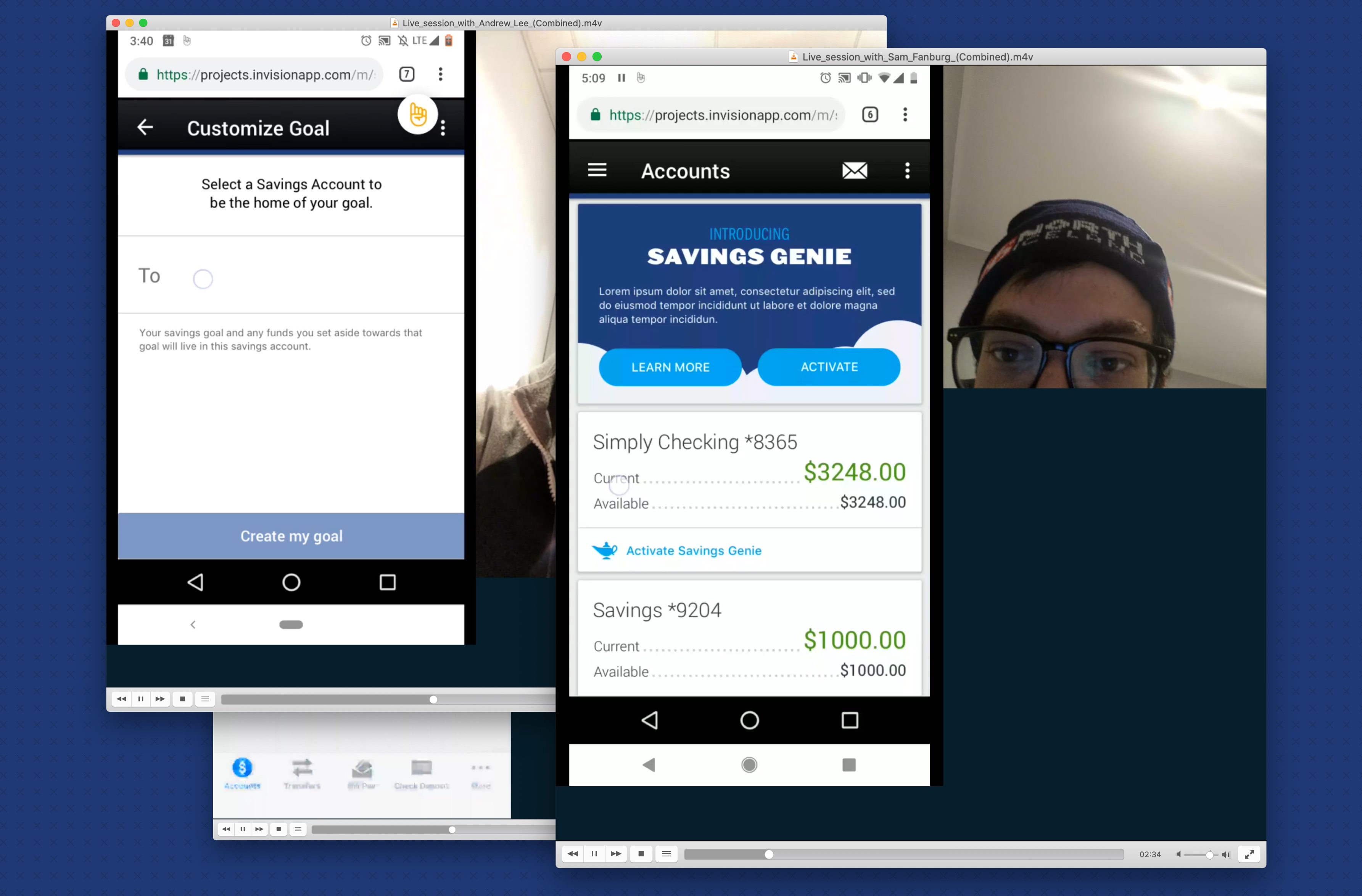
Once our prototypes were in a presentable format, we put out a call to potential users that fell into the demographic Fulton saw as a potential new user base for user testing. We scheduled five calls to have potential users walk through the application and speak about their experience with it. We were able to see the participant’s mobile phone screen as well as their camera to help us gather feedback on the product.
Usability Report
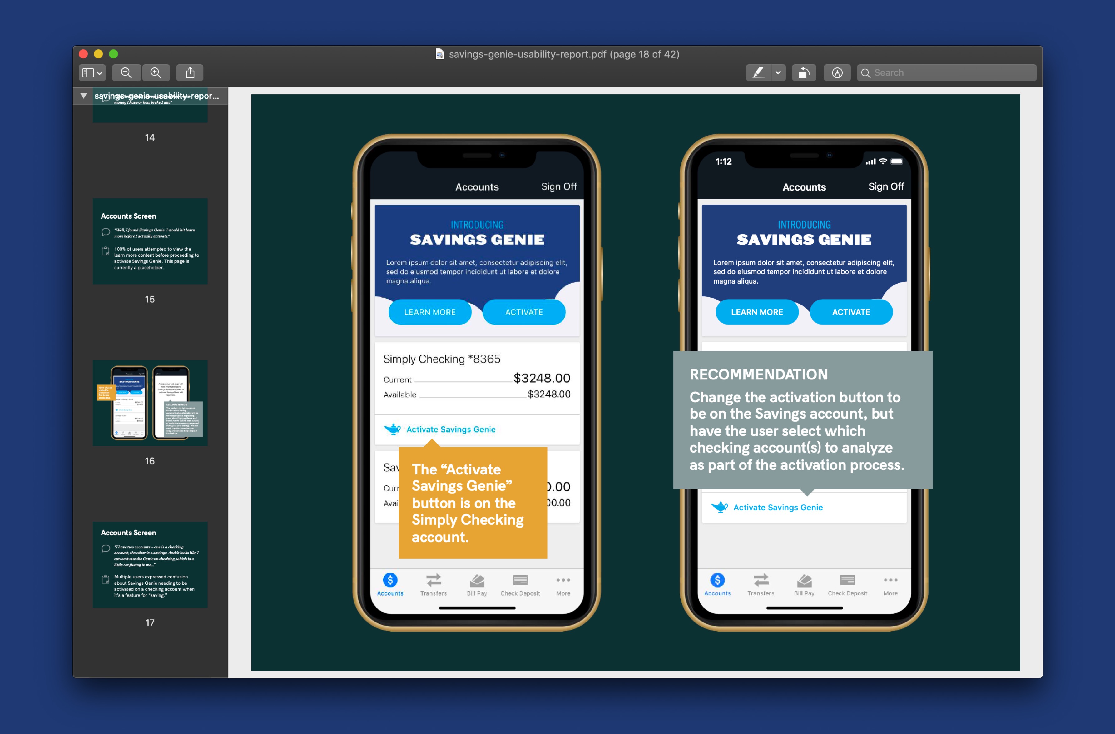
Once our user testing was done, we were able to synthesize our gathered feedback into actionable changes, which we presented to Fulton for review.
Final Design
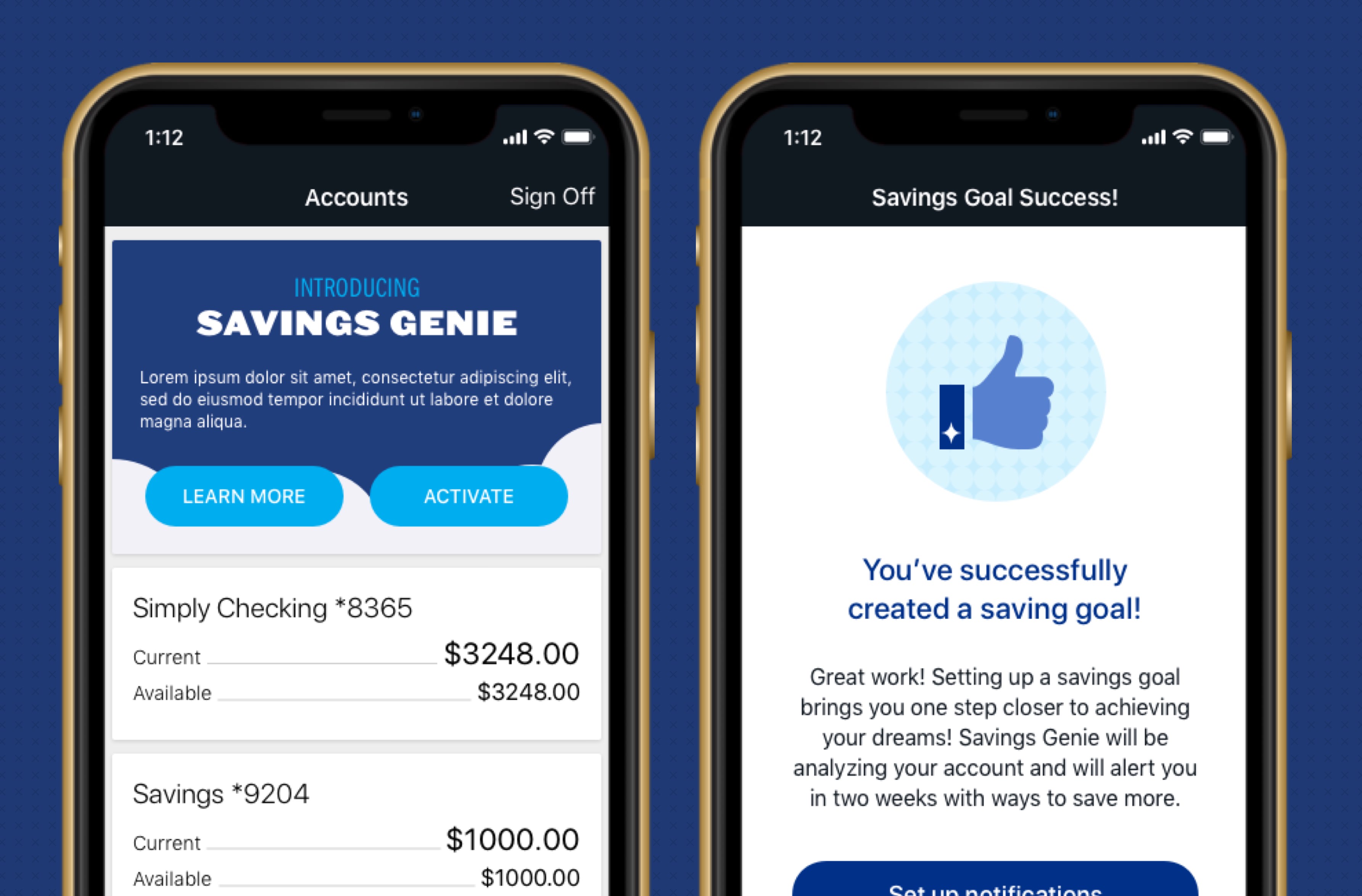
The feedback we collected from the business and users allowed us to tailor the application around real-life user needs, and deliver a user experience that we knew customers would love.
